Este manual apresenta o GESP, um sistema que atende e automatiza os processos de empresas de engenharia e projetos. Neste material será repassando as principais funcionalidades e características do sistema. O acesso ao sistema, as telas de uso e as principais ações realizadas pelo usuário são apresentadas passo a passo.
Informações Importantes
O sistema GESP está organizado em uma estrutura hierárquica de informação e, antes de começar a usá-lo é importante conhecer esta organização. Na imagem abaixo é demonstrando a hierarquia das informações, iniciado em cliente até documentos emitidos.
Dashboard Principal
Ao efetuar login no sistema será apresentado uma tela contendo indicadores da empresa.
1 - Apontamento de Horas
Módulo de Apontamento de Horas
1.1 - Registro de Horas
O apontamento de horas é o módulo onde todos os usuários do sistema podem registrar suas horas
empregadas no desenvolvimento dos projetos em suas diversas atividades.
Para acessar o apontamento clique no menu Apontamento de Horas, será exibida a tela abaixo. Nesta tela
será possível navegar entre os registros de horas através do calendário pelo lado esquerdo da tela.
Para registrar um apontamento de horas, clique no botão Novo e será exibido o seguinte formulário.
2 - Clientes
Módulo de Clientes
2.1 - Cadastro
O cadastro de cliente é uma etapa importante, todos os dados do sistema ficam relacionados à clientes. O
cliente é a origem de toda a informação.
Para cadastrar um novo cliente, acesse pelo menu Cadastro e depois Clientes, será exibida a tela abaixo
que disponibiliza a lista de todos os clientes cadastrados nos sistema.
3 - Contratos
Módulo de Contratos
3.1 - Cadastro
O contrato é um documento muito importante para a formalização de negócios e contratações. Ele
registra direitos e deveres das partes envolvidas em alguma transação
Para castrar um contrato, acesse o menu Cadastro e depois em Contrato, será exibido a tela que listará
todos os contratos cadastrados, então clique no botão Novo, que será exibido o formulário de cadastro de
contratos
3.2 - Encerramento de Contrato
Quando um contrato é encerrado, é necessário registrar o ato e encerramento do contrato para que não
mais sejam registrados dados relacionados ao contrato.
Para encerrar um contrato, acesse o menu Cadastro e Encerramento de Contrato e será exibido a seguinte
tela, listando todos os encerramentos de contratos já realizados. Clique em Novo e será exibido o
formulário para registrar o encerramento. Será possível anexar um documento ao encerramento do contrato
4 - Fornecedor
Módulo de Fornecedor
4.1 - Cadastro de Fornecedores
5 - GRD
Módulo de GRD
5.1 - Controle de Produtividade
O módulo de Gestão de Produtividade do sistema permite o registro e acompanhamento detalhado da participação dos colaboradores na elaboração de documentos técnicos.
Durante o processo de emissão do documento (GRD) para o cliente, o sistema possibilita indicar:
Quais funcionários participaram da elaboração do documento;
O percentual de contribuição de cada colaborador.
Essas informações são registradas automaticamente e ficam vinculadas ao histórico do documento, garantindo rastreabilidade e transparência em todo o ciclo de produção.
Além do registro, o sistema oferece uma interface completa para consulta e análise dos dados, com recursos como:
Aplicação de filtros por período, colaborador, projeto, tipo de documento, entre outros;
Possibilidade de exportar os resultados em planilhas Excel, facilitando a criação de relatórios personalizados, dashboards ou gráficos externos.
Esse controle permite:
Mensurar o esforço individual e coletivo das equipes;
Apoiar a avaliação de desempenho e a gestão de recursos;
Oferecer insumos confiáveis para tomadas de decisão e bonificações;
Identificar gargalos e oportunidades de melhoria nos processos.
⚙️ Essa funcionalidade é essencial para empresas que desejam acompanhar a produtividade com precisão e transformar dados operacionais em vantagem competitiva.
Tela de Consulta de Produtividade (Participação)
Calculo de A1 Produzido
Para todos os documentos emitidos no sistema, é possível registrar os colaboradores que participaram da sua elaboração, com um limite de até 3 participantes por documento. Para cada participante, deve ser informado o respectivo percentual de participação.
Com base nessas informações, o sistema realiza o cálculo da produtividade individual, considerando o percentual de participação de cada colaborador e o valor do A1 Produzido do documento.
Exemplo:
Documento: XPTO e A1 Produzido: 1.500
Participante
Percentual de Participação
A1 Participação
Colaborador 1
15%
0.225
Colaborador 2
35%
0.526
Colaborador 3
50%
0.750
A1 Produzido: representa o valor de produção do documento na visão de faturamento, refletindo o quanto foi efetivamente produzido e que será considerado para cobrança ao cliente.
Emissão de Documentos (GRD - Guia de Remessa de Documentos)
Para emitir um ou mais documentos, é necessário que estes estejam previamente cadastrados em uma LD (Lista de Documentos). Na barra superior do sistema, selecione o contrato ao qual os documentos pertencem.
Em seguida, acesse o menu Cadastrar e clique na opção LD / Documentos / GRD. Será exibido o Painel de Documentos.
Dentro do Painel de Documentos, localize a seção GRD (1). Para realizar a emissão, arraste os documentos desejados para esta área. Somente após essa ação os documentos estarão prontos para serem emitidos.
Para selecionar os documentos a serem emitidos, clique em um documento na seção Documentos e
arraste até a seção GRD, ou caso queira arrastar vários documentos, no teclado, com o botão Shift
pressionado, selecione com o mouse todos os documentos que deseja emitir e arraste a seção GRD.
Ao clicar no botão Gerar GRD, será apresentada a tela de emissão da GRD.
Para cada documento na tela existem dados que devem ser preenchidos, como: Motivo de Emissão, Meio
de Emissão. Na seção de Participação será possível informar quais os funcionários tiveram participação no
desenvolvimento de cada documento.
5.3 - Relatório
(1) Selecione uma GRD e (2) clique em Imprimir e um PDF será gerado com os dados da GRD
Visão do Relatório de GRD
6 - LD - Lista de Documentos
Módulo de LD - Lista de Documentos
6.1 - Cadastro
A LD é utilizada para organizar os documentos por listas individuais, um projeto pode ter uma ou mais
LDs.
Após selecionar um contrato, clique no menu Cadastro -> LD / Documentos / GRD e, será exibida a tela
contendo uma área de Lista de Documentos, nesta área (1) clique em Novo
Será exibido o formulário para cadastro de uma LD, (2) selecione o projeto desejado para qual a LD ficará
vinculada, e (3) forneça um título.
Assim que clicar no botão Salvar, será gerado uma nova LD que poderá receber os documentos. O código
da LD pode ser parametrizado de acordo com necessidade (necessário contato com o administrador do
sistema)
7 - Medição
Módulo de Medição
7.1 - Cadastro
A medição é um processo fundamental nos casos em que o controle da evolução dos serviços é exigido
como contrapartida financeira. Este processo busca garantir que o andamento físico da obra seja
monitorado, a fim de manter os custos realizados alinhados aos custos levantados durante a etapa de
planejamento.
O cadastro da medição é feito a nível do contrato, portanto um contrato deve estar selecionado para
então acessar o menu Cadastro -> Medição.
Ao acessar o módulo de medição, será exibida a seguinte tela, com as seguintes opções:
Tela de filtro: permite filtrar os registros de medições.
Tela de Medições: listagem permitindo agrupar as informações por qualquer coluna
Tela Arquivos: arquivos de uma medição, anexe a quantidade de arquivos que for necessário
Tela Gráfico: acompanhamento visual do valor medido ao longo do ano
Para cadastrar uma nova medição, clique no botão Novo e será exibido o formulário para cadastro da
medição.
7.2 - Faturamento
Toda medição deve ser enviada para ser faturada. A etapa de faturamento é o processo que registra a
intenção de faturar o que foi metido para um cliente.
Ao faturar uma medição, o setor de faturamento / pessoa responsável receberá um e-mail notificando a
existência de novo faturamento. As informações de faturamento também podem ser consultadas a
qualquer momento.
Para faturar uma medição, selecione a medição a ser faturada e clique no botão Enviar para Faturamento.
Após clicar em Enviar para Faturamento, será apresentado a tela para preenchimento de alguns dados
importantes.
Ao clicar em salvar, o faturamento será registrado e não será possível registrar um novo faturamento para
uma medição já faturada.
8 - Projetos
Módulo de Projetos
8.1 - Cadastro
O projeto é a forma de formalizar parte todo o escopo alinhado com o cliente, registrando os dados
necessários.
Para cadastrarmos um projeto, devemos previamente ter o contrato cadastrado, com o contrato já
cadastrado, selecione o contrato na aba barra superior do sistema.
Para cadastrar uma proposta acesse o menu Cadastro e depois Propostas, será exibido uma tela com a
lista de todas as propostas cadastradas. (1) Clique em Novo e o (2) formulário será exibido na tela para
que as informações sejam fornecidas e o (3) botão Salvar para registrar a proposta no sistema.
Após selecionar o contrato, clique no menu Cadastro e depois em Projetos / Centro de Custos e será
exibida a seguinte tela.
Com a tela de projetos aberta, clique no botão Novo e será exibido o seguinte formulário.
Campos:
Título: o título que descreve o projeto
OC / Pedido Cliente: é a informação da identificação do projeto no cliente. OC: ordem de compra
Responsável Contrato Cliente: é o responsável do cliente relacionado ao contrato, ou a este projeto em
específico
Proposta: é opcional o preenchimento da proposta. Caso preenchido, os dados financeiros do projeto
serão baseados na proposta informada
9 - Propostas
Módulo de Propostas
9.1 - Cadastro
Organize e controle suas propostas de acordo com a situação de cada uma delas. Com essa separação,
fica fácil ver o andamento dos atendimentos e conferir os prazos prometidos.
Para cadastrar uma proposta acesse o menu Cadastro e depois Propostas, será exibido uma tela com a
lista de todas as propostas cadastradas. (1) Clique em Novo e o (2) formulário será exibido na tela para
que as informações sejam fornecidas e o (3) botão Salvar para registrar a proposta no sistema.
10 - Documentos
Módulo de Documentos
10.1 - Atualização em Lote
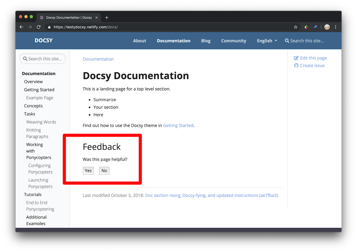
Optional guidance and recommendations on how to organize your documentation site.
Atualizar em lote dados de documentos
O GESP possui uma funcionalidade para auxiliar você em atualizar várias informações em diversos documentos, e isso tudo de uam vez só.
1 - Acesse o menu Cadastro -> Atualização Multipla de Dados
2 - Selecione a LD que contenha os documentos e clique em Buscar
3 - Selecione o campo que você quer atualizar, os campos estão representados em abas. Para a aba selecionda, preencha o valor desejado.
4 - Selecione os documentos que deve serm atualizados.
5 - Clique no botão atualizar
10.2 - Atualização Multipla
O cadastro e atualização múltipla é uma importante ferramenta para atualização em lote de dados de
documentos.
Na imagem temos 3 grandes opçõe:
1 - filtros para consultar documentos. preencha o filtro desejado e clique no botão Buscar;
2 - através das abas, escolha qual a informação do documento que deseja atualizar;
3 - selecione os documentos que serão atualizados e então clique no botão Atualizar.
10.3 - Cadastro
Um documento deve ser cadastrado dentro de uma LD, para cadastrar um documento tenha um contrato
selecionado, clique no menu Cadastro -> LD / Documentos / GRD.
Será exibido o formulário para cadastrar o documento (* Os campos em amarelo são preenchidos pelo sistema.)
10.4 - Cadastro de Copia de Verificaçao
Cópia de Verificação por Documento
O sistema conta com a funcionalidade de Cadastro de Cópia de Verificação, garantindo maior controle e rastreabilidade sobre as revisões de documentos de engenharia.
Como funciona
O desenhista/projetista responsável deve realizar a cópia de verificação de cada documento e submetê-la no sistema.
O sistema armazena a cópia de verificação, permitindo o download a qualquer momento.
Integração com a GRD
No momento da emissão de um documento na GRD, o usuário de planejamento terá disponível o ícone de download da cópia de verificação, quando existente.
Caso o ícone não esteja presente, significa que o documento ainda não possui cópia de verificação cadastrada.
Nessa situação, o usuário de planejamento poderá solicitar ao desenhista/projetista que providencie a cópia referente à revisão do documento.
Revisões de documentos
Sempre que um documento tem sua revisão elevada após o registro de retorno, é necessário enviar uma nova cópia de verificação correspondente à nova revisão.
As cópias de verificação de revisões anteriores permanecem disponíveis e podem ser acessadas no menu Download de Revisões.
10.5 - Cancelar Retorno de Documentos
Caso houver uma necessidade de remover as informações de retorno para uma emissão, na tela onde se
aplica o retorno de emissões de documentos, selecione um documento e clique em Cancelar Retorno.
10.6 - Controle de Revisão
Controlar de forma automatizada a revisão dos documentos é uma função importante para garantir a
rastreabilidade dos documentos e relacionar essas revisões a cada momento do ciclo de vida do
documento.
Caso precise de uma regra específica para elevar a revisão dos documentos, o sistema pode ser
customizado para atender essa especificidade.
10.7 - Desbloquear Documentos
A funcionalidade de desbloqueio de documentos permite que um documento bloqueado por um usuário seja liberado para edição. Esse recurso é útil quando o responsável pelo bloqueio não está disponível e outra pessoa precisa acessar o documento.
Apenas usuários com a permissão adequada podem realizar o desbloqueio. Para isso, basta acessar a tela do documento e clicar no botão “Desbloquear”.
Habilitar permissão para desbloquear documentos
10.8 - Download de Documentos
Para fazer download de um documento (1) clique no ícone verde, após clicar será apresentado uma tela
pedindo a confirmação se você deseja (2) editar o documento, caso confirme, o documento ficará
bloqueado para qualquer outro usuário, permitindo somente ao usuário que editou o documento a
possibilidade de submeter o documento, assim temos a segurança que somente um usuário faça a
alteração do documento. Após o usuário submeter o documento, este documento fica disponível para
qualquer outro usuário baixar/editar
Controle de Edição do Documento
Ao efetuar o download, deve ser informado se deseja editar o documento, caso informado Sim, será
gerado uma trava neste documento, impedindo que qualquer outro usuário também consiga efetuar o
download do documento em modo de edição. Até que o usuário que efetuou o download do documento,
deve fazer o upload (submeter) o documento para que a trava seja removida.
Este mecanismo garante que somente o usuário que fez download do documento em modo de edição
possa atualizá-lo.
10.9 - Histórico de Bloqueio
Para acessar o histórico clique no menu Consulta e Histórico de Bloqueio de Documentos.
Esta tela lista os registros de bloqueio (quando um usuário faz download do documento em modo de
edição e gera um bloqueio, não permitindo outro usuário editar) ou desbloqueio (quando o usuário
atualizou o documento removendo o bloqueio do documento).
10.10 - Restrição de Download
Você pode restringir o download de documentos com base no tipo de arquivo.
Para configurar essa restrição, é necessário ter perfil de administrador no sistema.
1 - Clique no seu usuário e selecione Perfis.
2 - Na tela que será exibida, escolha o perfil desejado.
3 - Marque os tipos de documentos que não podem ser baixados para esse perfil.
Pronto! Agora os usuários desse perfil não poderão fazer o download dos documentos selecionados.
10.11 - Retorno de Documentos
Todo documento é emitido para um destinatário (cliente) e, para cada documento enviado, o destinatário
retorna um tipo de status se o documento foi aprovado ou não foi aprovado. Este retorno deve ser
registrado no sistema através da função Retorno de Documentos.
Abaixo segue os tipos de retorno possíveis.
ACC- Aprovado com Comentários
CAN - Cancelado
APP - Aprovado
NAP - Não Aprovado
Regras:
Ao informar o retorno de um documento, este documento terá sua revisão elevada, exceto quando
retornado como Aprovado;
Não será possível realizar uma nova emissão para um documento em que sua última emissão não teve
retorno.
Para definir o retorno de um ou vários documentos de uma GRD, acesse o menu Cadastro e depois
Retorno de Documentos e será apresentado a seguinte tela.
(1) clique em buscar para listar os documentos emitidos em uma GRD, (2) informe a data de retorno do
documento, (3) selecione o motivo de retorno, (4) informe uma observação caso necessário, (5)
selecione os documento(s) a ser informado o retorno, (6) clique no botão Atualizar para aplicar as
informações de retorno aos documentos selecionados.
10.12 - Submeter Documentos
O sistema faz controles de GED (Gerenciamento Eletrônico de Documentos) possibilitando submeter
(upload) de documentos para que o sistema possa fazer o controle, armazenamento, indexação e elevar a
revisão do arquivo físico de forma automatizada.
Para submeter um documento ao sistema, (1) clique no ícone e será (2) exibido a tela para enviar o
arquivo desejado.
11 - Content and Customization
How to add content to and customize your Docsy site.
11.1 - Adding Content
Add different types of content to your Docsy site.
So you’ve got a new Hugo website with Docsy, now it’s time to add some content! This page tells you how to use the theme to add and structure your site content.
Content root directory
You add content for your site under the content root directory of your Hugo site project - either content/ or a language-specific root like content/en/. The main exception here is static files that you don’t want built into your site: you can find out more about where you add these below in Adding static content. The files in your content root directory are typically grouped in subdirectories corresponding to your site’s sections and templates, which we’ll look at in Content sections and templates.
Hugo builds your site pages using the content files you provide plus any templates provided by your site’s theme. These templates (or “layouts” in Hugo terminology) include things like your page’s headers, footers, navigation, and links to stylesheets: essentially, everything except your page’s specific content. The templates in turn can be made up of partials: little reusable snippets of HTML for page elements like headers, search boxes, and more.
Because most technical documentation sites have different sections for different types of content, the Docsy theme comes with the following templates for top-level site sections that you might need:
docs is for pages in your site’s Documentation section.
It also provides a default “landing page” type of template with the site header and footer, but no left nav, that you can use for any other section. In this site and our example site it’s used for the site home page and the About page.
Each top-level section in your site corresponds to a directory in your site content root. Hugo automatically applies the appropriate template for that section, depending on which folder the content is in. For example, this page is in the docs subdirectory of the site’s content root directory content/en/, so Hugo automatically applies the docs template. You can override this by explicitly specifying a template or content type for a particular page.
If you’ve copied the example site, you already have appropriately named top-level section directories for using Docsy’s templates, each with an index page ( _index.md or index.html) page for users to land on. These top-level sections also appear in the example site’s top-level menu.
Custom sections
If you’ve copied the example site and don’t want to use one of the provided content sections, just delete the appropriate content subdirectory. Similarly, if you want to add a top-level section, just add a new subdirectory, though you’ll need to specify the layout or content type explicitly in the frontmatter of each page if you want to use any existing Docsy template other than the default one. For example, if you create a new directory content/en/amazing and want one or more pages in that custom section to use Docsy’s docs template, you add type: docs to the frontmatter of each page:
+++title="My amazing new section"weight=1type="docs"description='''
A special section with a docs layout.
'''+++
---title:"My amazing new section"weight:1type:docsdescription:> A special section with a docs layout.---
{"title":"My amazing new section","weight":1,"type":"docs","description":"A special section with a docs layout.\n"}
Alternatively, create your own page template for your new section in your project’s layouts directory based on one of the existing templates.
You can find out much more about how Hugo page layouts work in Hugo Templates. The rest of this page tells you about how to add content and use each of Docsy’s templates.
Alternative site structure
As noted above, by default your site has a home page (using the _default layout), a docs section under /docs/, a blog section under /blog/ and a community section under /community/. The type of each section (which determines the layout it uses) matches its directory name.
In some cases, you may want to have a different directory structure, but still make use of Docsy’s layouts. A common example is for a “docs site”, where most of the pages (including the home page) use the docs layout, or perhaps you’d rather have a /news/ directory treated with the blog layout.
Since Hugo 0.76, this has become practical without copying layouts to your site, or having to specify type: blog on every single page by making use of target specific cascading front matter.
For example, for the /news/ section, you can specify the following front matter in the index page which will change the type of the section and everything below it to “blog”:
If you want to create a “docs” site, specifying something like the following in the top level _index.md will set all top level sections to be treated as “docs”, except for “news”:
Note the addition of toc_root here. Setting that to true for a section causes it to be treated as a separate part of the site, with its own left hand navigation menu.
An example docs-based site that uses this technique can be found at the mostly docs repo.
Page frontmatter
Each page file in a Hugo site has metadata frontmatter that tells Hugo about the page. You specify page frontmatter in TOML, YAML, or JSON (our example site and this site use YAML). Use the frontmatter to specify the page title, description, creation date, link title, template, menu weighting, and even any resources such as images used by the page. You can see a complete list of possible page frontmatter in Front Matter.
For example, here’s the frontmatter for this page:
+++title="Adding Content"linkTitle="Adding Content"weight=1description='''
Add different types of content to your Docsy site.
'''+++
---title:"Adding Content"linkTitle:"Adding Content"weight:1description:> Add different types of content to your Docsy site.---
{"title":"Adding Content","linkTitle":"Adding Content","weight":1,"description":"Add different types of content to your Docsy site.\n"}
The minimum frontmatter you need to provide is a title: everything else is up to you! However, if you leave out the page weight, your navigation may get a little disorganized. You may also want to include description since Docsy uses that to generate the meta description tag used by search engines. See Search Engine Optimization (SEO) meta tags for details.
Page contents and markup
By default you create pages in a Docsy site as simple Markdown or HTML files with page frontmatter, as described above.
As of version 0.100, Goldmark is the only Markdown parser supported by Hugo.
Tip
If you’ve been using versions of Hugo before 0.60 that use BlackFriday as its Markdown parser, you may need to make some small changes to your site to work with the current Goldmark Markdown parser. In particular, if you cloned an earlier version of our example site, add the following to your hugo.toml/hugo.yaml/hugo.json to allow Goldmark to render raw HTML as well as Markdown:
In addition to your marked-up text, you can also use Hugo and Docsy’s shortcodes: reusable chunks of HTML that you can use to quickly build your pages. Find out more about shortcodes in Docsy Shortcodes.
Note
Hugo also supports adding content using other markups using external parsers as helpers. For example, you can add content in RST using rst2html as an external parser (though be aware this does not support all flavors of RST, such as Sphinx RST). Similarly, you can use asciidoctor to parse Asciidoc files, or pandoc for other formats.
External parsers may not be suitable for use with all deployment options, as you’ll need to install the external parser and run Hugo yourself to generate your site (so, for example, you won’t be able to use Netlify’s continuous deployment feature). In addition, adding an external parser may cause performance issues building larger sites.
Working with links
Hugo lets you specify links using normal Markdown syntax, though remember that you need to specify links relative to your site’s root URL, and that relative URLs are left unchanged by Hugo in your site’s generated HTML.
Alternatively you can use Hugo’s helper ref and relref shortcodes for creating internal links that resolve to the correct URL. However, be aware this means your links will not appear as links at all if a user views your page outside your generated site, for example using the rendered Markdown feature in GitHub’s web UI.
You can find (or add!) tips and gotchas for working with Hugo links in Hugo Tips.
Content style
We don’t mandate any particular style for your page contents. However, if you’d like some guidance on how to write and format clear, concise technical documentation, we recommend the Google Developer Documentation Style Guide, particularly the Style Guide Highlights.
Page bundles
You can create site pages as standalone files in their section or subsection directory, or as folders where the content is in the folder’s index page. Creating a folder for your page lets you bundle images and other resources together with the content.
You can see examples of both approaches in this and our example site. For example, the source for this page is just a standalone file /content/en/docs/adding-content.md. However the source for Docsy Shortcodes in this site lives in /content/en/docs/adding-content/shortcodes/index.md, with the image resource used by the page in the same /shortcodes/ directory. In Hugo terminology, this is called a leaf bundle because it’s a folder containing all the data for a single site page without any child pages (and uses index.md without an underscore).
You can find out much more about managing resources with Hugo bundles in Page Bundles.
Adding docs and blog posts
The template you’ll probably use most often is the docs template (as used in this page) or the very similar blog template. Both these templates include:
a left nav
GitHub links (populated from your site config) for readers to edit the page or create issues
a page menu
as well as the common header and footer used by all your site’s pages. Which template is applied depends on whether you’ve added the content to the blog or docs content directory. You can find out more about how the nav and page menu are created in Navigation and Search.
Organizing your documentation
While Docsy’s top-level sections let you create site sections for different types of content, you may also want to organize your docs content within your docs section. For example, this site’s docs section directory has multiple subdirectories for Getting Started, Content and Customization, and so on. Each subdirectory has an _index.md (it could also be an _index.html), which acts as a section index page and tells Hugo that the relevant directory is a subsection of your docs.
Docsy’s docs layout gives you a left nav pane with an autogenerated nested menu based on your docs file structure. Each standalone page or subsection _index.md or _index.html page in the docs/ directory gets a top level menu item, using the link name and weight metadata from the page or index.
To add docs to a subsection, just add your page files to the relevant subdirectory. Any pages that you add to a subsection in addition to the subsection index page will appear in a submenu (look to the left to see one in action!), again ordered by page weight. Find out more about adding Docsy’s navigation metadata in Navigation and Search
If you’ve copied the example site, you’ll already have some suggested subdirectories in your docs directory, with guidance for what types of content to put in them and some example Markdown pages. You can find out more about organizing your content with Docsy in Organizing Your Content.
Docs section landing pages
By default a docs section landing page (the _index.md or _index.html in the section directory) uses a layout that adds a formatted list of links to the pages in the section, with their frontmatter descriptions. The Content and Customization landing page in this site is a good example.
To display a simple bulleted list of links to the section’s pages instead, specify simple_list: true in the landing page’s frontmatter:
+++title="Simple List Page"simple_list=trueweight=20+++
---title:"Simple List Page"simple_list:trueweight:20---
{"title":"Simple List Page","simple_list":true,"weight":20}
To display no links at all, specify no_list: true in the landing page’s frontmatter:
+++title="No List Page"no_list=trueweight=20+++
---title:"No List Page"no_list:trueweight:20---
{"title":"No List Page","no_list":true,"weight":20}
Organizing your blog posts
Docsy’s blog layout also gives you a left nav menu (like the docs layout), and a list-type index page for your blog that’s applied to /blog/_index.md and automatically displays snippets of all your recent posts in reverse chronological order.
To create different blog categories to organize your posts, create subfolders in blog/. For instance, in our example site we have news and releases. Each category needs to have its own _index.md or _index.html landing page file specifying the category title for it to appear properly in the left nav and top-level blog landing page. Here’s the index page for releases:
To add author and date information to blog posts, add them to the page frontmatter:
+++date=2018-10-06T00:00:00.000Ztitle="Easy documentation with Docsy"linkTitle="Announcing Docsy"description="The Docsy Hugo theme lets project maintainers and contributors focus on content, not on reinventing a website infrastructure from scratch"author="Riona MacNamara"[[resources]]src="**.{png,jpg}"title="Image #:counter"[resources.params]byline="Photo: Riona MacNamara / CC-BY-CA"+++
---date:2018-10-06title:"Easy documentation with Docsy"linkTitle:"Announcing Docsy"description:"The Docsy Hugo theme lets project maintainers and contributors focus on content, not on reinventing a website infrastructure from scratch"author:Riona MacNamararesources:- src:"**.{png,jpg}"title:"Image #:counter"params:byline:"Photo: Riona MacNamara / CC-BY-CA"---
{"date":"2018-10-06T00:00:00.000Z","title":"Easy documentation with Docsy","linkTitle":"Announcing Docsy","description":"The Docsy Hugo theme lets project maintainers and contributors focus on content, not on reinventing a website infrastructure from scratch","author":"Riona MacNamara","resources":[{"src":"**.{png,jpg}","title":"Image #:counter","params":{"byline":"Photo: Riona MacNamara / CC-BY-CA"}}]}
If you’ve copied the example site and you don’t want a blog section, or want to link to an external blog instead, just delete the blog subdirectory.
Working with top-level landing pages.
Docsy’s default page template has no left nav and is useful for creating a home page for your site or other “landing” type pages.
Customizing the example site pages
If you’ve copied the example site, you already have a simple site landing page in content/en/_index.html. This is made up of Docsy’s provided Hugo shortcode page blocks.
To customize the large landing image, which is in a cover block, replace the content/en/featured-background.jpg file in your project with your own image (it can be called whatever you like as long as it has background in the file name). You can remove or add as many blocks as you like, as well as adding your own custom content.
The example site also has an About page in content/en/about/_index.html using the same Docsy template. Again, this is made up of page blocks, including another background image in content/en/about/featured-background.jpg. As with the site landing page, you can replace the image, remove or add blocks, or just add your own content.
Building your own landing pages
If you’ve just used the theme, you can still use all Docsy’s provided page blocks (or any other content you want) to build your own landing pages in the same file locations.
Adding a community page
The community landing page template has boilerplate content that’s automatically filled in with the project name and community links specified in hugo.toml/hugo.yaml/hugo.json, providing your users with quick links to resources that help them get involved in your project. The same links are also added by default to your site footer.
[params.links]# End user relevant links. These will show up on left side of footer and in the community page if you have one.[[params.links.user]]name="User mailing list"url="https://example.org/mail"icon="fa fa-envelope"desc="Discussion and help from your fellow users"[[params.links.user]]name="Twitter"url="https://example.org/twitter"icon="fab fa-x-twitter"desc="Follow us on Twitter to get the latest news!"[[params.links.user]]name="Stack Overflow"url="https://example.org/stack"icon="fab fa-stack-overflow"desc="Practical questions and curated answers"# Developer relevant links. These will show up on right side of footer and in the community page if you have one.[[params.links.developer]]name="GitHub"url="https://github.com/google/docsy"icon="fab fa-github"desc="Development takes place here!"[[params.links.developer]]name="Slack"url="https://example.org/slack"icon="fab fa-slack"desc="Chat with other project developers"[[params.links.developer]]name="Developer mailing list"url="https://example.org/mail"icon="fa fa-envelope"desc="Discuss development issues around the project"
params:links:user:- name:User mailing listurl:'https://example.org/mail'icon:fa fa-envelopedesc:Discussion and help from your fellow users- name:Twitterurl:'https://example.org/twitter'icon:fab fa-x-twitterdesc:Follow us on Twitter to get the latest news!- name:Stack Overflowurl:'https://example.org/stack'icon:fab fa-stack-overflowdesc:Practical questions and curated answersdeveloper:- name:GitHuburl:'https://github.com/google/docsy'icon:fab fa-githubdesc:Development takes place here!- name:Slackurl:'https://example.org/slack'icon:fab fa-slackdesc:Chat with other project developers- name:Developer mailing listurl:'https://example.org/mail'icon:fa fa-envelopedesc:Discuss development issues around the project
{"params":{"links":{"user":[{"name":"User mailing list","url":"https://example.org/mail","icon":"fa fa-envelope","desc":"Discussion and help from your fellow users"},{"name":"Twitter","url":"https://example.org/twitter","icon":"fa-brands fa-x-twitter","desc":"Follow us on Twitter to get the latest news!"},{"name":"Stack Overflow","url":"https://example.org/stack","icon":"fa-brands fa-stack-overflow","desc":"Practical questions and curated answers"}],"developer":[{"name":"GitHub","url":"https://github.com/google/docsy","icon":"fa-brands fa-github","desc":"Development takes place here!"},{"name":"Slack","url":"https://example.org/slack","icon":"fa-brands fa-slack","desc":"Chat with other project developers"},{"name":"Developer mailing list","url":"https://example.org/mail","icon":"fa fa-envelope","desc":"Discuss development issues around the project"}]}}}
If you’re creating your own site and want to add a page using this template, add a /community/_index.md file in your content root directory. If you’ve copied the example site and don’t want a community page, just delete the /content/en/community/ directory in your project repo.
By default, Docsy layouts assume that your project’s contributing page is found
at <baseURL>/docs/contribution-guidelines. To specify another URL, add it to
the front matter of /community/_index.md as illustrated next. The URL can be
an external URL or a local path:
params:contributingUrl:docs/contributing/
Adding static content
You may want to serve some non-Hugo-built content along with your site: for example, if you have generated reference docs using Doxygen, Javadoc, or other doc generation tools.
To add static content to be served “as-is”, just add the content as a folder and/or files in your site’s static directory. When your site is deployed, content in this directory is served at the site root path. So, for example, if you have added content at /static/reference/cpp/, users can access that content at http://{server-url}/reference/cpp/ and you can link to pages in this directory from other pages at /reference/cpp/{file name}.
You can also use this directory for other files used by your project, including image files. You can find out more about serving static files, including configuring multiple directories for static content, in Static Files.
RSS feeds
Hugo will, by default, create an RSS feed for the home page and any section.
To disable all RSS feeds, add the following to your
hugo.toml/hugo.yaml/hugo.json:
disableKinds=["RSS"]
disableKinds:[RSS]
{"disableKinds":["RSS"]}
Note
If you have enabled our print feature or otherwise specified section-level output formats in hugo.toml/hugo.yaml/hugo.json, make sure that "RSS" is listed as an output format, otherwise you won’t get section-level RSS feeds (and your blog section won’t get a nice orange RSS button). Your hugo.toml/hugo.yaml/hugo.json specification overrides the Hugo default output formats for sections, which are HTML and RSS.
[outputs]section=["HTML","RSS","print"]
outputs:section:- HTML- RSS- print
{"outputs":{"section":["HTML","RSS","print"]}}
Sitemap
Hugo creates a sitemap.xml file for your generated site by default: for example, here’s the sitemap for this site.
You can configure the frequency with which your sitemap is updated, your sitemap filename, and the default page priority in your hugo.toml/hugo.yaml/hugo.json:
To override any of these values for a given page, specify it in page frontmatter:
+++title="Adding Content"linkTitle="Adding Content"weight=1description='''
Add different types of content to your Docsy site.
'''[sitemap]priority=1+++
---title:"Adding Content"linkTitle:"Adding Content"weight:1description:> Add different types of content to your Docsy site.sitemap:priority:1.0---
{"title":"Adding Content","linkTitle":"Adding Content","weight":1,"description":"Add different types of content to your Docsy site.\n","sitemap":{"priority":1}}
Customize colors, fonts, code highlighting, and more for your site.
By default, a site using Docsy has the theme’s default fonts, colors, and
general look and feel. However, if you want your own color scheme (and you
probably will!) you can very easily override the theme defaults with your own
project-specific values - Hugo will look in your project files first when
looking for information to build your site. And because Docsy uses Bootstrap 5
and SCSS for styling, you can override just single values (such as project
colors and fonts) in its special SCSS project variables file, or do more serious
customization by creating your own styles.
Docsy also provides options for styling your code blocks, using either Chroma or
Prism for highlighting.
Project style files
To customize your project’s look and feel, create your own version of the
following Docsy placeholder files (note the _project*.scss suffixes) and
place them inside your project’s assets/scss/ folder:
Use these files to add project-specific definitions of theme variables as well
as any additional Bootstrap variables you want to set or override. For
details, including an explanation of which file to use, see
Site colors.
_styles_project.scss is where you can add your own custom SCSS styles,
including overriding any of the styles in Docsy’s theme SCSS files.
Tip
PostCSS (autoprefixing of CSS browser-prefixes) is not enabled when running in
server mode (it is a little slow), so Chrome is the recommended choice for
development.
Colors and color themes
Site colors
To customize your site’s colors, add SCSS variable overrides to
assets/scss/_variables_project.scss. For example, you can set the primary
and secondary site colors as follows:
$primary:#390040;$secondary:#a23b72;
Docsy has Bootstrap features such as gradient backgrounds
($enable-gradients) and shadows ($enable-shadows) enabled by default. These
can also be toggled in your project variables file by setting the variables to
false.
To add colors to or modify Bootstrap’s color maps, use
assets/scss/_variables_project_after_bs.scss. For example:
Docsy 0.10.0 supports light and dark mode color themes. To allow your website
users to choose light/dark modes, enable the Docsy light/dark menu or
create your own custom theme selector.
If your site uses Chroma for code highlighting, there are extra steps required
so that code-block styles are compatible with light/dark mode:
Ensure that markup.highlight.noClasses is false in your project config.
For details about this option, see Generate syntax highlighter CSS.
Light/dark color themes, only affect documentation pages, and white blocks
shortcodes.
Fonts
The theme uses Open Sans as its
primary font. To disable Google Fonts and use a system font, set this SCSS
variable in assets/scss/_variables_project.scss:
Note that if you decide to go with a font with different weights (in the
built-in configuration this is 300 (light), 400 (medium) and 700 (bold)),
you also need to adjust the weight related variables, i.e. variables starting
with $font-weight-.
CSS utilities
For documentation of available CSS utility classes, see the Bootstrap
documentation. This theme adds very little on its own in this area.
However, we have added some color state CSS classes that can be useful in a
dynamic context:
.-bg-<color>
.-text-<color>
You can use these classes, for example, to style your text in an appropriate
color when you don’t know if the primary color is dark or light, to ensure
proper color contrast. They are also useful when you receive the color code as a
shortcode parameter.
The value of <color> can be any of the color names, primary, white,
dark, warning, light, success, 300, blue, orange etc.
When you use .-bg-<color>, the text colors will be adjusted to get proper
contrast:
As of Hugo 0.60+, you can choose from a range of code block highlight and color
styles using Chroma. These styles are
applied to your fenced code blocks. For details about code highlighting in Hugo
using Chroma, see Syntax Highlighting.
Chroma style configuration
Hugo’s default Chroma style is monokai. To use another style, such as tango,
add the following to your project configuration:
By default, highlighting is not applied to code blocks without a specified
language. If you would like code highlighting to apply to all code blocks,
even without a language, set markup.highlight.guessSyntax to true in your
project’s configuration file.
Copy to clipboard
If you are using a Docsy 0.6.0 or later, code blocks show a “Copy to clipboard”
button in the top right-hand corner. To disable this functionality, set
disable_click2copy_chroma to true in your configuration file:
Code highlighting with Prism
Optionally, you can enable Prism syntax highlighting in your
hugo.toml/hugo.yaml/hugo.json:
[params]prism_syntax_highlighting=true
params:prism_syntax_highlighting:true
{"params":{"prism_syntax_highlighting":true}}
When this option is enabled your site uses
Prism instead of Chroma for code block
highlighting.
Prism is a popular open source syntax highlighter which supports over 200
languages and various
plugins.
Docsy includes JavaScript and CSS files for a basic Prism configuration, which
supports:
Code blocks styled with the Prism Default theme
Copy to clipboard buttons on code blocks
Syntax highlighting for a number of common languages, as specified in the
following Prism download link, Customize your download.
Code blocks with no language
By default, Prism code highlighting styles are not applied to code blocks
without a specified language, instead you get Docsy’s default style of grey with
black text. To apply Prism styling to code blocks with no language or a language
not supported by Prism, specify none as the language after your triple
backticks.
Extending Prism for additional languages or plugins
If the included Prism configuration is not sufficient for your requirements, and
you want to use additional languages or plugins you can replace the included
files with your own.
Replace the included Prism JS and CSS with the files you downloaded:
Copy the Javascript file to static/js/prism.js
Copy the CSS file to static/css/prism.css
Navbar
Styling your project logo and name
The default Docsy navbar (.td-navbar) displays your site identity, consisting
of the following:
Your logo, which is included in the navbar as an inline SVG, styled by
.td-navbar .navbar-brand svg. For the style details, see _nav.scss.
To ensure your logo displays correctly, you may want to resize it and ensure
that it doesn’t have height and width attributes so that its size is fully
responsive. Override the default styling of
.td-navbar .navbar-brand svg or (equivalently)
.td-navbar .navbar-brand__logo as needed.
Your project name, which is the site title. If you don’t want your project
name to appear (for example, because your logo is or contains a
wordmark), then add the following custom styling to your project’s
styles:
.td-navbar.navbar-brand__name{display:none;}
Light/dark mode menu
If you enable this feature, Docsy adds a menu to your navbar that lets users
switch your site’s documentation page display between a default “light” mode,
and a “dark” mode where the text is displayed in a light color on a dark
background.
To enable the display of a light/dark mode menu in the navbar, set
params.ui.showLightDarkModeMenu to true in your project’s configuration
file. The dropdown menu appears at the right, immediately before the search
box, if present.
[params][params.ui]showLightDarkModeMenu=true
params:ui:showLightDarkModeMenu:true
{"params":{"ui":{"showLightDarkModeMenu":true}}}
Translucent over cover images
For pages containing a blocks/cover shortcode, like most homepages, the
navbar is translucent as long as the hero image hasn’t scrolled up past the
navbar. For an example, see the About Docsy page. This initial translucent
setting ensures that the hero image is maximally visible.
After the hero image has scrolled past the navbar, the navbar’s (opaque)
background color is set – usually to the site’s primary color.
The text of navbar entries can be difficult to read with some hero images. In
these cases, you can disable navbar translucency by setting the
params.ui.navbar_translucent_over_cover_disable option to true in your
site’s configuration file.
Tables
Docsy applies the following styles to all tables, through the class .td-table:
display: block, which is necessary for tables to be responsive.
This styling configuration gives you responsive tables using Markdown only,
without the need to wrap the table in a <div>. It does, however, mean that all
your tables have display set to block. If you don’t want this, you can
create your own custom styles for tables.
Note
Our table styling goes against the Bootstrap recommendation to wrap
tables with .table-responsive — however, we think letting
users create responsive tables with just Markdown table syntax is more
convenient.
To render a table without Docsy styling, apply the .td-initial class to the
table. From the resulting <table> style base, it is easier to apply your own
custom styles (rather than trying to undo Docsy table styling), as is
illustrated in the following example:
The example above uses Markdown attribute syntax, and might render like
this:
Shape
Number of sides
Triangle
3
Square
4
Customizing templates
Add code to head or before body end
If you need to add some code (CSS import, cookie consent, or similar) to the
head section on every page, add the head-end.html partial to your project:
layouts/partials/hooks/head-end.html
And add the code you need in that file. Your partial code is automatically
included just before the end of the theme partial
head.html.
The theme version of
head-end.html
is empty.
Similarly, if you want to add some code right before the body end, create your
own version of the following file:
layouts/partials/hooks/body-end.html
Any code in this file is included automatically at the end of the theme partial
scripts.html.
Both head.html and scripts.html are then used to build Docsy’s
base page layout,
which is used by all the other page templates:
By default, Docsy adds the td-{{ .Kind }} class, where the kind is the kind of
the page, like section, blog, and so on. For example:
<bodyclass="td-section">
Sometimes it’s useful to assign custom classes to a page, or to an entire
section, for example, to apply custom styling. To do so, add the body_class
parameter to the front matter of your page. The value of the parameter will then
be added to the class attribute of your page’s body element.
To add the classes myclass and anotherclass, add the following line to the
front matter of the page:
body_class:myclass anotherclass
The page’s opening body tag will look like this (assuming it is a section page):
<bodyclass="td-section myclass anotherclass">
To apply the custom class to every page of a section or a directory, use the
Front Matter Cascade
feature of Hugo in your configuration file, or in the front matter of the
highest-level page you want to modify.
11.3 - Navigation and Menus
Customize site navigation for your Docsy site.
Docsy provides multiple built-in navigation features for your sites, including site menus, section menus, and page menus. This page shows you how they work and how to configure and customize them to meet your needs.
Top-level menu
The top level menu (the one that appears in the top navigation bar for the entire site) uses your site’s main menu. All Hugo sites have a main menu array of menu entries, accessible via the .Site.Menus site variable and populatable via page front matter or your site’s hugo.toml/hugo.yaml/hugo.json.
To add a page or section to this menu, add it to the site’s main menu in either hugo.toml/hugo.yaml/hugo.json or in the destination page’s front matter (in _index.md or _index.html for a section, as that’s the section landing page). For example, here’s how we added the Documentation section landing page to the main menu in this site:
+++title="Welcome to Docsy"linkTitle="Documentation"[menu.main]weight=20pre="<i class='fa-solid fa-book'></i>"+++
---title:"Welcome to Docsy"linkTitle:"Documentation"menu:main:weight:20pre:<i class='fa-solid fa-book'></i>---
{"title":"Welcome to Docsy","linkTitle":"Documentation","menu":{"main":{"weight":20,"pre":"<i class='fa-solid fa-book'></i>"}}}
The menu is ordered from left to right by page weight. So, for example, a section index or page with weight: 30 would appear after the Documentation section in the menu, while one with weight: 10 would appear before it.
If you want to add a link to an external site to this menu, add it in hugo.toml/hugo.yaml/hugo.json, specifying the weight.
As described in the Hugo docs, you can add icons to the top-level menu by using the pre and/or post parameter for main menu items defined in your site’s hugo.toml/hugo.yaml/hugo.json or via page front matter. For example, the following configuration adds the GitHub icon to the GitHub menu item, and a New! alert to indicate that this is a new addition to the menu.
If you configure more than one language in hugo.toml, the Docsy theme adds a language selector drop down to the top-level menu. Selecting a language takes the user to the translated version of the current page, or the home page for the given language.
The section menu, as shown in the left side of the docs section, is automatically built from the content tree. Like the top-level menu, it is ordered by page or section index weight (or by page creation date if weight is not set), with the page or index’s Title, or linkTitle if different, as its link title in the menu. If a section subfolder has pages other than _index.md or _index.html, those pages will appear as a submenu, again ordered by weight. For example, here’s the metadata for this page showing its weight and title:
+++title="Navigation and Search"linkTitle="Navigation and Search"date=2017-01-05T00:00:00.000Zweight=3description='''
Customize site navigation and search for your Docsy site.
'''+++
---title:"Navigation and Search"linkTitle:"Navigation and Search"date:2017-01-05weight:3description:> Customize site navigation and search for your Docsy site.---
{"title":"Navigation and Search","linkTitle":"Navigation and Search","date":"2017-01-05T00:00:00.000Z","weight":3,"description":"Customize site navigation and search for your Docsy site.\n"}
To hide a page or section from the left navigation menu, set toc_hide: true in the front matter.
To hide a page from the section summary on a docs section landing page, set hide_summary: true in the front matter. If you want to hide a page from both the TOC menu and the section summary list, you need to set both toc_hide and hide_summary to true in the front matter.
+++title="My Hidden Page"weight=99toc_hide=truehide_summary=truedescription='''
Page hidden from both the TOC menu and the section summary list.
'''+++
---title:"My Hidden Page"weight:99toc_hide:truehide_summary:truedescription:> Page hidden from both the TOC menu and the section summary list.---
{"title":"My Hidden Page","weight":99,"toc_hide":true,"hide_summary":true,"description":"Page hidden from both the TOC menu and the section summary list.\n"}
Section menu options
By default, the section menu shows the current section fully expanded all the way down. This may make the left nav too long and difficult to scan for bigger sites. Try setting site parameter ui.sidebar_menu_compact = true in hugo.toml.
With the compact menu (.ui.sidebar_menu_compact = true), only the current page’s ancestors, siblings and direct descendants are shown. You can use the optional parameter .ui.ul_show to set a desired menu depth to always be visible. For example, with .ui.ul_show = 1 the first menu level is always displayed.
The number of sidebar entries shown per section can be configured using the .ui.sidebar_menu_truncate parameter (default: 100).
As well as the completely expanded and compact menu options, you can also create a foldable menu by setting the site parameter ui.sidebar_menu_foldable = true in hugo.toml. The foldable menu lets users expand and collapse menu sections by toggling arrow icons beside the section parents in the menu.
On large sites (default: > 2000 pages) the section menu is not generated for each page, but cached for the whole section. The HTML classes for marking the active menu item (and menu path) are then set using JS. You can adjust the limit for activating the cached section menu with the optional parameter .ui.sidebar_cache_limit.
The tabbed pane below lists the menu section options you can define in your project configuration file.
You can add icons to the section menu in the sidebar by setting the icon parameter in the page front matter (e.g. icon: fa-solid fa-screwdriver-wrench).
You can find a complete list of icons to use in the FontAwesome documentation. Docsy includes the free FontAwesome icons by default.
Out of the box, if you want to use icons, you should define icons for all items on the same menu level in order to ensure an appropriate look. If the icons are used in a different way, individual CSS adjustments are likely necessary.
Add manual links to the section menu
By default the section menu is entirely generated from your section’s pages. If you want to add a manual link to this menu, such as a link to an external site or a page in a different section of your site, you can do this by creating a placeholder page file in the doc hierarchy with the appropriate weight and some special parameters in its metadata (frontmatter) to specify the link details.
To create a placeholder page, create a page file as usual in the directory where you want the link to show up in the menu, and add a manualLink parameter to its metadata. If a page has manualLink in its metadata, Docsy generates a link for it in the section menu for this page and in the section index (the list of the child pages of a section on a landing page - see description in the Docsy docs), but the link destination is replaced by the value of manualLink. The link text is the title (or linkTitle if set) of your placeholder page. You can optionally also set the title attribute of the link with the parameter manualLinkTitle and a link target with manualLinkTarget - for example if you want an external link to open in a new tab you can set the link target to _blank. Docsy automatically adds rel=noopener to links that open new tabs as a security best practice.
You can also use manualLink to add an additional cross reference to another existing page of your site. For internal links you can choose to use the parameter manualLinkRelref instead of manualLink to use the built-in Hugo function relref. If relref can’t find a unique page in your site, Hugo throws a error message.
Note
Although all generated menu and landing page links based on your placeholder file are set according to the parameters manualLink or manualLinkRelref, Hugo still generates a regular HTML site page for the file, albeit one with no generated links to it. To avoid confusion if users accidentally land on a generated placeholder page, we recommend specifying the URL for the external link in the normal content and / or page description of the page.
Breadcrumb navigation
Breadcrumb navigation appears at the top of each non-index page be default. To
also display single-element breadcrumb lists in index pages, add the following
style override to your project:
Breadcrumb navigation is also shown for each item in the taxonomy results page
— that is, when you click one of the taxonomy labels such as Categories
or Tags.
As illustrated next, you can disable (non-taxonomy) breadcrumb navigation for an
entire project, by setting ui.breadcrumb_disable to true in your project
configuration file. Similarly, you can disabled taxonomy breadcrumbs by
setting ui.taxonomy_breadcrumb_disable to true:
To disable breadcrumbs in a specific page or section set ui.breadcrumb_disable
to true in the page or section-index front matter. Here is an example of the
latter:
cascade:params:ui:breadcrumb_disable:true
Heading self links
Docsy supports build-time generation of heading self links using Hugo’s
render-heading.htmlhook.
To enable this feature in
your project, define layouts/_default/_markup/render-heading.html as:
The heading self-link anchor class is .td-heading-self-link, which you can
customize for your project. By default, the heading self-link style has these defaults:
The self-link symbol is #.
The symbol is always visible on mobile and touch devices, otherwise it is only
visible on hover or focus.
Your projects can also reuse (in your own custom heading render hook) or
override the heading self-link template
_default/_markup/_td-heading-self-link.html, which is defined in
layouts/_default/_markup/td-render-heading.html.
11.4 - Search
Let users search your Docsy site with a choice of configurable search options.
Docsy offers multiple options that let your readers search your site content, so
you can pick one that suits your needs or design your own. You
can choose from:
Google Custom Search Engine
(GCSE), the default option, which uses Google’s index of your public site to
generate a search results page.
Algolia DocSearch, which uses Algolia’s indexing and
search mechanism. Search results are displayed as a pop-up. Algolia DocSearch
is free for public documentation sites.
Local search with Lunr, which uses Javascript to
index and search your site without the need to connect to external services.
This option doesn’t require your site to be public.
If you enable any of these search options in your project configuration file,
a search box displays in the right of your top navigation bar. By default a
search box also displays at the top of the section menu in the left navigation
pane, which you can disable if you prefer, or if you’re using a search option
that only works with the top search box.
You can only enable a single search option at a time
If you accidentally enable more than one search option in your project
configuration file, you will get a warning at build time, and undetermined
behavior when serving your site.
Disabling the sidebar search box
By default, the search box appears in both the top navigation bar and at the top
of the sidebar left navigation pane. If you don’t want the sidebar search box,
set the site parameter sidebar_search_disable to true in
hugo.toml/hugo.yaml/hugo.json:
[params.ui]sidebar_search_disable=true
params:ui:sidebar_search_disable:true
{"params":{"ui":{"sidebar_search_disable":true}}}
Configure search with a Google Custom Search Engine
By default Docsy uses a Google Custom Search Engine (GCSE) to search
your site. To enable this feature, you’ll first need to make sure that you have
built and deployed a
production version of your site,
as otherwise your site won’t be crawled and indexed.
Setting up site search
Create a Google Custom Search Engine for your deployed site by clicking
New search engine on the Custom Search page and following the
instructions. Make a note of the ID for your new search engine.
Add any further configuration you want to your search engine using the
Edit search engine options. In particular you may want to do the
following:
Select Look and feel. Change from the default Overlay layout to
Results only, as this option means your search results are embedded in
your search page rather than appearing in a separate box. Click Save
to save your changes.
Edit the default result link behavior so that search results from your
site don’t open in a new tab. To do this, select Search Features -
Advanced - Websearch Settings. In the Link Target field, type
“_parent”. Click Save to save your changes.
Once you have your search engine set up, you can add the feature to your site:
Ensure you have a Markdown file in content/en/search.md (and one per other
languages if needed) to display your search results. It only needs a title
and layout: search, as in the following example:
+++title="Search Results"layout="search"+++
---title:Search Resultslayout:search---
{"title":"Search Results","layout":"search"}
Add your Google Custom Search Engine ID to the site params in
hugo.toml/hugo.yaml/hugo.json. You can add different values per
language if needed.
[params]# Google Custom Search Engine ID. Remove or comment out to disable search.gcs_engine_id="011737558837375720776:fsdu1nryfng"
If you don’t specify a Google Custom Search Engine ID for your project and
haven’t enabled any other search options, the search box won’t appear in your
site. If you’re using the default hugo.toml from the example site and want to
disable search, just comment out or remove the relevant line.
Algolia DocSearch
As an alternative to GCSE, you can use
Algolia DocSearch, which is free for public
documentation sites. Docsy supports Algolia DocSearch v3.
Algolia v2 is deprecated
Docsy previously supported Algolia DocSearch v2, which is now deprecated. If you
are an existing Algolia DocSearch v2 user and want to use the latest Docsy
version, follow the
migration instructions
in the DocSearch documentation to update your DocSearch code snippet.
Sign up for Algolia DocSearch
Complete the form at https://docsearch.algolia.com/apply. Proceed to the next
step once you’ve received Algolia DocSearch parameters for your project.
Eager to test DocSearch?
Docsy defaults to the Algolia test-site parameters when none are provided.
To enable search over the Algolia test, define params.search.algolia without
any other fields, as outlined next.
To learn more about Algolia DocSearch V3, see
Getting started.
When you’ve completed these steps, Algolia search should be enabled on your
site. Search results are displayed as a pop-up, so you don’t need to add any
search results page.
Customizing Algolia templates
You can customize or disable Docsy’s default Algolia support by creating the
following template files:
layouts/partials/algolia/head.html used by head.html to load Algolia
DocSearch styles. It also issues a deprecation warning for
params.algolia_docsearch.
layouts/partials/algolia/scripts.html used by scripts.html to load and
configure Algolia DocSearch.
Leave either file empty to disable Docsy’s implementation.
Local search with Lunr
Lunr is a Javascript-based search option that lets you
index your site and make it searchable without the need for external,
server-side search services. This is a good option particularly for smaller or
non-public sites.
To add Lunr search to your Docsy site:
Enable local search in hugo.toml/hugo.yaml/hugo.json.
[params]offlineSearch=true
params:offlineSearch:true
{"params":{"offlineSearch":true}}
Remove or comment out any GCSE ID in hugo.toml/hugo.yaml/hugo.json and
ensure Algolia DocSearch is set to false, as you can only have one type of
search enabled. See Disabling GCSE search.
Once you’ve completed these steps, local search is enabled for your site and
results appear in a drop down when you use the search box.
Tip
If you’re testing this locally
using Hugo’s local server functionality, you need to build your
offline-search-index.xxx.json file first by running hugo. If you have the
Hugo server running while you build offline-search-index.xxx.json, you may
need to stop the server and restart it in order to see your search results.
Changing the summary length of the local search results
You can customize the summary length by setting offlineSearchSummaryLength in
hugo.toml/hugo.yaml/hugo.json.
#Enable offline search with Lunr.js[params]offlineSearch=trueofflineSearchSummaryLength=200
If none of the supported search engines address your project’s needs, you can
implement your own custom search. If your searchbox fits within Docsy’s standard
design, then you can implement custom search by overriding the following files:
Customize navigation and banners for multiple versions of your docs.
Depending on your project’s releases and versioning, you may want to let your
users access previous versions of your documentation. How you deploy the
previous versions is up to you. This page describes the Docsy features that you
can use to provide navigation between the various versions of your docs and
to display an information banner on the archived sites.
Adding a version drop-down menu
If you add some [params.versions] in hugo.toml/hugo.yaml/hugo.json, the Docsy theme adds a
version selector drop down to the top-level menu. You specify a URL and a name
for each version you would like to add to the menu, as in the following example:
# Add your release versions here[[params.versions]]version="master"url="https://master.kubeflow.org"[[params.versions]]version="v0.2"url="https://v0-2.kubeflow.org"[[params.versions]]version="v0.3"url="https://v0-3.kubeflow.org"
Remember to add your current version so that users can navigate back!
The default title for the version drop-down menu is Releases. To change the
title, change the site parameter version_menu in hugo.toml/hugo.yaml/hugo.json:
[params]version_menu="Releases"
params:version_menu:Releases
{"params":{"version_menu":"Releases"}}
If you set the version_menu_pagelinks parameter to true, then links in the version drop-down menu
point to the current page in the other version, instead of the main page.
This can be useful if the document doesn’t change much between the different versions.
Note that if the current page doesn’t exist in the other version, the link will be broken.
If you create archived snapshots for older versions of your docs, you can add a
note at the top of every page in the archived docs to let readers know that
they’re seeing an unmaintained snapshot and give them a link to the latest
version.
For example, see the archived docs for
Kubeflow v0.6:
Figure 1. The banner on the archived docs for Kubeflow v0.6
To add the banner to your doc site, make the following changes in your
hugo.toml/hugo.yaml/hugo.json file:
Set the site parameter archived_version to true:
[params]archived_version=true
params:archived_version:true
{"params":{"archived_version":true}}
Set the site parameter version to the version of the archived doc set. For
example, if the archived docs are for version 0.1:
[params]version="0.1"
params:version:0.1
{"params":{"version":"0.1"}}
Make sure that site parameter url_latest_version contains the URL of the website that you
want to point readers to. In most cases, this should be the URL of the latest
version of your docs:
Use Docsy’s Hugo shortcodes to quickly build site pages.
Rather than writing all your site pages from scratch, Hugo lets you define and use shortcodes. These are reusable snippets of content that you can include in your pages, often using HTML to create effects that are difficult or impossible to do in simple Markdown. Shortcodes can also have parameters that let you, for example, add your own text to a fancy shortcode text box. As well as Hugo’s built-in shortcodes, Docsy provides some shortcodes of its own to help you build your pages.
Shortcode delimiters
As illustrated below, using the bracket styled shortcode delimiter,
{{<...>}}, tells Hugo that the inner content is HTML/plain text and needs
no further processing. By using the delimiter {{%...%}}, Hugo will treat
the shortcode body as Markdown. You can use both styles in your pages.
Shortcode blocks
The theme comes with a set of custom Page Block shortcodes that can be used to compose landing pages, about pages, and similar.
These blocks share some common parameters:
height
A pre-defined height of the block container. One of min, med, max, full, or auto. Setting it to full will fill the Viewport Height, which can be useful for landing pages.
color
The block will be assigned a color from the theme palette if not provided, but you can set your own if needed. You can use all of Bootstrap’s color names, theme color names or a grayscale shade. Some examples would be primary, white, dark, warning, light, success, 300, blue, orange. This will become the background color of the block, but text colors will adapt to get proper contrast.
blocks/cover
The blocks/cover shortcode creates a landing page type of block that fills the top of the page.
{{<blocks/covertitle="Welcome!"image_anchor="center"height="full"color="primary">}}
<divclass="mx-auto"><aclass="btn btn-lg btn-primary me-3 mb-4"href="{{< relref "/docs">}}">
Learn More <iclass="fa-solid fa-circle-right ms-2"></i></a><aclass="btn btn-lg btn-secondary me-3 mb-4"href="https://example.org"> Download <iclass="fa-brands fa-github ms-2"></i></a><pclass="lead mt-5">This program is now available in <ahref="#">AppStore!</a></p><divclass="mx-auto mt-5"> {{<blocks/link-downcolor="info">}}
</div></div>{{< /blocks/cover >}}
Note that the relevant shortcode parameters above will have sensible defaults, but is included here for completeness.
Parameter
Default
Description
title
The main display title for the block.
image_anchor
height
See above.
color
See above.
byline
Byline text on featured image.
To set the background image, place an image with the word “background” in the name in the page’s Page Bundle. For example, in our the example site the background image in the home page’s cover block is featured-background.jpg, in the same directory.
Tip
If you also include the word featured in the image name, e.g. my-featured-background.jpg, it will also be used as the Twitter Card image when shared.
The blocks/section shortcode is meant as a general-purpose content container. It comes in two “flavors”, one for general content and one with styling more suitable for wrapping a horizontal row of feature sections.
The example below shows a section wrapping 3 feature sections.
{{<blocks/sectioncolor="dark"type="row">}}{{%blocks/featureicon="fa-lightbulb"title="Fastest OS **on the planet**!"%}}The new **TechOS** operating system is an open source project. It is a new project, but with grand ambitions.
Please follow this space for updates!
{{%/blocks/feature%}}{{%blocks/featureicon="fa-brands fa-github"title="Contributions welcome!"url="https://github.com/gohugoio/hugo"%}}We do a [Pull Request](https://github.com/gohugoio/hugo/pulls) contributions workflow on **GitHub**. New users are always welcome!
{{%/blocks/feature%}}{{%blocks/featureicon="fa-brands fa-x-twitter"title="Follow us on Twitter!"url="https://twitter.com/GoHugoIO"%}}For announcement of latest features etc.
{{%/blocks/feature%}}{{</blocks/section>}}
Parameter
Default
Description
height
See above.
color
See above.
type
Specify “container” (the default) if you want a general container, or “row” if the section will contain columns – which must be immediate children.
blocks/feature
{{%blocks/featureicon="fa-brands fa-github"title="Contributions welcome!"url="https://github.com/gohugoio/hugo"%}}We do a [Pull Request](https://github.com/gohugoio/hugo/pulls) contributions workflow on **GitHub**. New users are always welcome!
{{%/blocks/feature%}}
The blocks/link-down shortcode creates a navigation link down to the next section. It’s meant to be used in combination with the other blocks shortcodes.
The alert shortcode creates an alert block that can be used to display notices or warnings.
{{%alerttitle="Warning"color="warning"%}}This is a warning.
{{%/alert%}}
Renders to:
Warning
This is a warning.
Parameter
Default
Description
color
primary
One of the theme colors, eg primary, info, warning etc.
pageinfo
The pageinfo shortcode creates a text box that you can use to add banner information for a page: for example, letting users know that the page contains placeholder content, that the content is deprecated, or that it documents a beta feature.
{{%pageinfocolor="info"%}}This is placeholder content.
{{%/pageinfo%}}
Renders to:
This is placeholder content
Parameter
Default
Description
color
primary
One of the theme colors, eg primary, info, warning etc.
imgproc
The imgproc shortcode finds an image in the current Page Bundle and scales it given a set of processing instructions.
{{%imgprocspruceFill"400x450"%}}Norway Spruce *Picea abies* shoot with foliage buds.
{{%/imgproc%}}
Use the syntax above if the inner content and/or the byline parameter of your shortcode is authored in markdown. In case of HTML content, use <> as innermost delimiters: {{< imgproc >}}<b>HTML</b> content{{< /imgproc >}}.
Norway Spruce Picea abies shoot with foliage buds.
Photo: Bjørn Erik Pedersen / CC-BY-SA
The example above has also a byline with photo attribution added. When using illustrations with a free license from WikiMedia and similar, you will in most situations need a way to attribute the author or licensor. You can add metadata to your page resources in the page front matter. The byline param is used by convention in this theme:
+++[[resources]]src="**spruce*.jpg"[resources.params]byline="*Photo*: Bjørn Erik Pedersen / CC-BY-SA"+++
---resources:- src:"**spruce*.jpg"params:byline:"*Photo*: Bjørn Erik Pedersen / CC-BY-SA"---
{"resources":[{"src":"**spruce*.jpg","params":{"byline":"*Photo*: Bjørn Erik Pedersen / CC-BY-SA"}}]}
Parameter
Description
1
The image filename or enough of it to identify it (we do Glob matching)
You can place the swaggerui shortcode anywhere inside a page with the swagger layout; it renders Swagger UI using any OpenAPI YAML or JSON file as source. This file can be hosted anywhere you like, for example in your site’s root /static folder.
+++title="Pet Store API"type="swagger"weight=1description="Reference for the Pet Store API"+++{{<swaggeruisrc="/openapi/petstore.yaml">}}
---title:"Pet Store API"type:swaggerweight:1description:Reference for the Pet Store API---{{< swaggerui src="/openapi/petstore.yaml" >}}
{"title":"Pet Store API","type":"swagger","weight":1,"description":"Reference for the Pet Store API"}{{<swaggeruisrc="/openapi/petstore.yaml">}}
You can customize Swagger UI’s look and feel by overriding Swagger’s CSS in themes/docsy/assets/scss/_swagger.scss.
Warning
This shortcode relies on JavaScript libraries hosted on unpkg. Make sure that you can access unpkg from your network when building or loading your site.
redoc
The redoc shortcode uses the open-source Redoc tool to render reference API documentation from an OpenAPI YAML or JSON file. This can be hosted anywhere you like, for example in your site’s root /static folder, but you can use a URL as well, for example:
---title:"Pet Store API"type:docsweight:1description:Reference for the Pet Store API---{{< redoc "https://raw.githubusercontent.com/OAI/OpenAPI-Specification/main/examples/v2.0/yaml/petstore.yaml" >}}
If true the shortcode tries to calculate the needed height for the embedded content using JavaScript, as described here: https://stackoverflow.com/a/14618068. This is only possible if the embedded content is on the same domain. Note that even if the embedded content is on the same domain, it depends on the structure of the content if the height can be calculated correctly.
style
min-height:98vh; border:none;
CSS styles for the iframe. min-height:98vh; is a backup if tryautoheight doesn’t work. border:none; removes the border from the iframe - this is useful if you want the embedded content to look more like internal content from your page.
sandbox
false
You can switch the sandbox completely on by setting sandbox = true or allow specific functionality with the common values for the iframe parameter sandbox defined in the HTML standard.
There are several tools you can use to check if a website can be embedded via iframe - e.g.: https://gf.dev/x-frame-options-test. Be aware that when this test says “Couldn’t find the X-Frame-Options header
in the response headers.” you CAN embed it, but when the test says “Great! X-Frame-Options header was found in the HTTP response headers as highlighted below.”, you CANNOT - unless it has been explicitly enabled for your site.
Tabbed panes
Sometimes it’s very useful to have tabbed panes when authoring content. One common use-case is to show multiple syntax highlighted code blocks that showcase the same problem, and how to solve it in different programming languages. As an example, the tabbed pane below shows the language-specific variants of the famous Hello world! program one usually writes first when learning a new programming language:
The Docsy template provides two shortcodes tabpane and tab that let you easily create tabbed panes. To see how to use them, have a look at the following code block, which renders to a right aligned pane with one disabled and three active tabs:
This code translates to the right aligned tabbed pane below, showing a Welcome! greeting in English, German or Swahili:
Welcome!
Herzlich willkommen!
Karibu sana!
Shortcode details
Tabbed panes are implemented using two shortcodes: tabpane containing two or
more nested tabs.
tabpane
The tabpane shortcode, which is the container element for the tabs, supports
the following named parameters, all of which are optional:
lang: the default code-block language to use for all contained tabs
highlight: parameter passed on to the code-block highlight function,
as described below
langEqualsHeader: set to true when header text matches the tab language.
persist: one of header, lang, or disabled
persistLang: deprecated, use persist instead
right: set to true if you want right-aligned tabs
text: set to true if the content of all contained tabs are text. Default
is false and assumes the content is code.
The value of the optional parameters lang and highlight are passed on as
second LANG and third OPTIONS arguments to Hugo’s built-in highlight
function, which is used to render the code blocks of the individual tabs.
Tab selection is persisted by default. When unspecified, persist defaults to
header when text=true or lang is set; otherwise persist defaults to
lang. To disable tab persistence, set persist=disable.
tab
The tab shortcode represent the tabs you want to show. It supports the
following named parameters, all of which are optional:
header: defines the tab’s header text. When omitted it defaults to text of
the form “Tab n”. You can omit the parameter name if it is the only tab
parameter:
{{< tab "My tab header" >}} … {{< /tab >}}
lang: code-block language for code tabs
highlight: parameter passed on to the code-block highlight function
right: set to true in order to split tab panes into a left aligned and a
right aligned tab groups. Specify right=true in the dividing tab. By using
right=true more than once, you can even render multiple tab groups.
disabled: set to true to disable a tab.
text: set to true for text tabs. By default tabs are assumed to
contain code.
For enabled tabs, there are two modes for content display, code representation
and textual representation:
By default, the tab’s content is rendered as a code block. In order to get
proper syntax highlighting, specify the named parameter lang –and
optionally the parameter highlight– for each tab. Parameters set in the
parent tabpane shortcode will be overwritten.
If the contents of your tabs should be rendered as text with different styles
and optional images, specify text=true as parameter of your tab:
Reminder: If your content is markdown, use the percent sign % as
delimiter for your tab shortcode, like this:
{{% tab %}} Your \*\*markdown\*\* content {{% /tab %}}
Card panes
When authoring content, it’s sometimes very useful to put similar text blocks or code fragments on card like elements, which can be optionally presented side by side. Let’s showcase this feature with the following sample card group which shows the first four Presidents of the United States:
George Washington
*1732 †1799
President: 1789 – 1797
John Adams
* 1735 † 1826
President: 1797 – 1801
Thomas Jefferson
* 1743 † 1826
President: 1801 – 1809
James Madison
* 1751 † 1836
President: 1809 – 1817
Docsy supports creating such card panes via different shortcodes:
The cardpane shortcode which is the container element for the various cards to be presented.
The card shortcodes, with each shortcode representing an individual card. While cards are often presented inside a card group, a single card may stand on its own, too. A card shortcode can hold programming code, text, images or any other arbitrary kind of markdown or HTML markup as content. In case of programming code, cards provide automatic code-highlighting and other optional features like line numbers, highlighting of certain lines, ….
Shortcode card: textual content
Make use of the card shortcode to display a card. The following code sample demonstrates how to code a card element:
{{<cardheader="**Imagine**"title="Artist and songwriter: John Lennon"subtitle="Co-writer: Yoko Ono"footer="">}}Imagine there's no heaven, It's easy if you try<br/>No hell below us, above us only sky<br/>Imagine all the people living for today…
…
{{</card>}}
This code translates to the left card shown below, showing the lyrics of John Lennon’s famous song Imagine. A second explanatory card element to the right indicates and explains the individual components of a card:
Imagine
Artist and songwriter: John Lennon
Co-writer: Yoko Ono
Imagine there’s no heaven, It’s easy if you try
No hell below us, above us only sky
Imagine all the people living for today…
Imagine there’s no countries, it isn’t hard to do
Nothing to kill or die for, and no religion too
Imagine all the people living life in peace…
Imagine no possessions, I wonder if you can
No need for greed or hunger - a brotherhood of man
Imagine all the people sharing all the world…
You may say I’m a dreamer, but I’m not the only one
I hope someday you’ll join us and the world will live as one
Header: specified via named parameter Header
Card title: specified via named parameter title
Card subtitle: specified via named parameter subtitle
Content: inner content of the shortcode, this may be plain text or formatted text, images, videos, … . If your content is markdown, use the percent sign % as outermost delimiter of your card shortcode, your markup should look like {{% card %}}Your **markdown** content{{% /card %}}. In case of HTML content, use square brackets <> as outermost delimiters: {{< card >}}Your <b>HTML</b> content{{< /card >}}
While the main content of the card is taken from the inner markup of the card shortcode, the optional elements footer, header, title, and subtitle are all specified as named parameters of the shortcode.
Shortcode card: programming code
If you want to display programming code on your card, set the named parameter code of the card to true. The following sample demonstrates how to code a card element with the famous Hello world! application coded in C:
If called with parameter code=true, the card shortcode can optionally hold the named parameters lang and/or highlight. The values of these optional parameters are passed on as second LANG and third OPTIONS arguments to Hugo’s built-in highlight function which is used to render the code block presented on the card.
Card groups
Displaying two ore more cards side by side can be easily achieved by putting them between the opening and closing elements of a cardpane shortcode.
The general markup of a card group resembles closely the markup of a tabbed pane:
Contrary to tabs, cards are presented side by side, however. This is especially useful it you want to compare different programming techniques (traditional vs. modern) on two cards, like demonstrated in the example above:
Java 5
File[] hiddenFiles = new File("directory_name")
  .listFiles(new FileFilter() {
    public boolean accept(File file) {
      return file.isHidden();
    }
  });
Java 8, Lambda expression
File[] hiddenFiles = new File("directory_name")
  .listFiles(File::isHidden);
Include external files
Sometimes there’s content that is relevant for several documents, or that is
maintained in a file that is not necessarily a document. For situations like
these, the readfile shortcode allows you to import the contents of an external
file into a document.
Reuse documentation
In case you want to reuse some content in several documents, you can write said
content in a separate file and include it wherever you need it.
For example, suppose you have a file called installation.md with the following
contents:
## Installation
{{%alerttitle="Note"color="primary"%}}Check system compatibility before proceeding.
{{%/alert%}}1. Download the installation files.
1. Run the installation script
`sudo sh install.sh`
1. Test that your installation was successfully completed.
You can import this section into another document:
The following section explains how to install the database:
{{%readfile"installation.md"%}}
This is rendered as if the instructions were in the parent document. Hugo
v0.101.0+ is required for imported files containing shortcodes to be rendered
correctly.
The following section explains how to install the database:
Installation
Note
Check system compatibility before proceeding.
Download the installation files.
Run the installation script
sudo sh install.sh
Test that your installation was successfully completed.
The parameter is the relative path to the file. Only relative paths
under the parent file’s working directory are supported.
For files outside the current working directory you can use an absolute path
starting with /. The root directory is the /content folder.
Include code files
Suppose you have an includes folder containing several code samples you want
to use as part of your documentation. You can use readfile with some
additional parameters:
To create a new pipeline, follow the next steps:
1. Create a configuration file `config.yaml`:
{{<readfilefile="includes/config.yaml"code="true"lang="yaml">}}1. Apply the file to your cluster `kubectl apply config.yaml`
This code automatically reads the content of includes/config.yaml and inserts it
into the document. The rendered text looks like this:
The conditional-text shortcode allows you to show or hide parts of your content depending on the value of the buildCondition parameter set in your configuration file. This can be useful if you are generating different builds from the same source, for example, using a different product name. This shortcode helps you handle the minor differences between these builds.
{{% conditional-text include-if="foo" %}}
This text appears in the output only if `buildCondition = "foo" is set in your config file`.
{{% /conditional-text %}}
{{% conditional-text exclude-if="bar" %}}
This text does not appear in the output if `buildCondition = "bar" is set in your config file`.
{{% /conditional-text %}}
If you are using this shortcode, note that when evaluating the conditions, substring matches are matches as well. That means, if you set include-if="foobar", and buildcondition = "foo", you have a match!
11.7 - Logos and Images
Add and customize logos, icons, and images in your project.
Add your logo
By default, Docsy shows a site logo at the start of the navbar, that is, at the
extreme left. Place your project’s SVG logo in assets/icons/logo.svg. This
overrides the default Docsy logo in the theme.
If you don’t want a logo to appear in the navbar, then set site parameter navbar_logo
to false in your project’s config:
Docsy includes the free FontAwesome icons by default, including logos for sites like GitHub and Stack Overflow. You can view all available icons in the FontAwesome documentation, including the FontAwesome version when the icon was added and whether it is available for free tier users. Check Docsy’s package.json and release notes for Docsy’s currently included version of FontAwesome.
The easiest way to do this is to create a set of favicons via http://cthedot.de/icongen (which lets you create a huge range of icon sizes and options from a single image) and/or https://favicon.io, and put them in your site project’s static/favicons directory. This will override the default favicons from the theme.
Note that https://favicon.io doesn’t create as wide a range of sizes as Icongen but does let you quickly create favicons from text: if you want to create text favicons you can use this site to generate them, then use Icongen to create more sizes (if necessary) from your generated .png file.
If you have special favicon requirements, you can create your own layouts/partials/favicons.html with your links.
Add images
Landing pages
Docsy’s blocks/cover shortcode make it easy to add large cover images to your landing pages. The shortcode looks for an image with the word “background” in the name inside the landing page’s Page Bundle - so, for example, if you’ve copied the example site, the landing page image in content/en/_index.html is content/en/featured-background.jpg.
You specify the preferred display height of a cover block container (and hence its image) using the block’s height parameter. For a full viewport height, use full:
{{<blocks/covertitle="Welcome to the Docsy Example Project!"image_anchor="top"height="full">}}
...
{{< /blocks/cover >}}
For a shorter image, as in the example site’s About page, use one of min, med, max or auto (the actual height of the image):
{{<blocks/covertitle="About the Docsy Example"image_anchor="bottom"height="min">}}
...
{{< /blocks/cover >}}
Other pages
To add inline images to other pages, use the imgproc shortcode. Alternatively, if you prefer, just use regular Markdown or HTML images and add your image files to your project’s static directory. You can find out more about using this directory in Adding static content.
Images used on this site
Images used as background images in this site are in the public domain and can be used freely. The porridge image in the example site is by iha31 from Pixabay.
11.8 - Print Support
Making it easier to print entire sections of documentation.
Individual documentation pages print well from most browsers as the layouts have been styled to omit navigational chrome from the printed output.
On some sites, it can be useful to enable a “print entire section” feature (as seen in this user guide). Selecting this option renders the entire current top-level section (such as Content and Customization for this page) with all of its child pages and sections in a format suited to printing, complete with a table of contents for the section.
To enable this feature, add the “print” output format in your site’s hugo.toml/hugo.yaml/hugo.json file for the “section” type:
[outputs]section=["HTML","RSS","print"]
outputs:section:- HTML- RSS- print
{"outputs":{"section":["HTML","RSS","print"]}}
The site should then show a “Print entire section” link in the right hand navigation.
Further Customization
Disabling the ToC
To disable showing the the table of contents in the printable view, set the disable_toc param to true, either in the page front matter, or in hugo.toml/hugo.yaml/hugo.json:
+++…disable_toc=true…+++
---…disable_toc:true…---
{…,"disable_toc":true,…}
[params.print]disable_toc=true
params:print:disable_toc:true
{"params":{"print":{"disable_toc":true}}}
Layout hooks
A number of layout partials and hooks are defined that can be used to customize the printed format. These can be found in layouts/partials/print.
Hooks can be defined on a per-type basis. For example, you may want to customize the layouts of heading for “blog” pages vs “docs”. This can be achieved by creating layouts/partials/print/page-heading-<type>.html - eg. page-heading-blog.html. It defaults to using the page title and description as a heading.
Similarly, the formatting for each page can be customized by creating layouts/partials/print/content-<type>.html.
11.9 - Analytics, User Feedback, and SEO
Add Google Analytics tracking to your site, collect user feedback and learn about the page description meta tag.
You will need an analytics ID for your website before proceeding
(technically it’s called a measurement ID or property ID but we’ll use the term
“analytics ID” in this guide). If you don’t have one, see the How to get
started section of Introducing Google Analytics 4 (GA4).
Tip
Your project’s analytics ID is a string that starts with G- (a GA4
measurement ID) or UA- (a universal analytics property ID).
Setup
Enable Google Analytics by adding your project’s analytics ID to the site
configuration file. For details, see Configure Google Analytics.
Deprecation note and warning
While you can configure your project’s analytics ID by setting either the
top-level googleAnalytics config parameter or services.googleAnalytics.id,
googleAnalytics was deprecated in Hugo 0.120.0 and
will be removed in a future release.
Analytics are enabled only for production builds (called “environments”
in Hugo terminology). For information about Hugo environments and how to set
them, see the following discussion.
User Feedback
By default Docsy puts a “was this page helpful?” feedback widget at the bottom
of every documentation page, as shown in Figure 1.
Figure 1. The feedback widget, outlined in red
After clicking Yes the user should see a response like Figure 2. You can
configure the response text in your project’s configuration file.
Figure 2. An example Yes response
How is this data useful?
When you have a lot of documentation, and not enough time to update it all, you
can use the “was this page helpful?” feedback data to help you decide which
pages to prioritize. In general, start with the pages with a lot of pageviews
and low ratings. “Low ratings” in this context means the pages where users are
clicking No — the page wasn’t helpful — more often than Yes — the
page was helpful. You can also study your highly-rated pages to develop
hypotheses around why your users find them helpful.
In general, you can develop more certainty around what patterns your users find
helpful or unhelpful if you introduce isolated changes in your documentation
whenever possible. For example, suppose that you find a tutorial that no longer
matches the product. You update the instructions, check back in a month, and the
score has improved. You now have a correlation between up-to-date instructions
and higher ratings. Or, suppose you study your highly-rated pages and discover
that they all start with code samples. You find 10 other pages with their code
samples at the bottom, move the samples to the top, and discover that each
page’s score has improved. Since this was the only change you introduced on each
page, it’s more reasonable to believe that your users find code samples at the
top of pages helpful. The scientific method, applied to technical writing, in
other words!
Setup
Version note
As of Docsy version 0.8.0, feedback will be enabled whether
site.Config.Services.GoogleAnalytics.ID is set or not. This supports the use
case where analytics is configured outside of Docsy.
Open your project’s Hugo configuration file.
Set the response text that users see after clicking Yes or No.
[params.ui.feedback]enable=trueyes='Glad to hear it! Please <a href="https://github.com/USERNAME/REPOSITORY/issues/new">tell us how we can improve</a>.'no='Sorry to hear that. Please <a href="https://github.com/USERNAME/REPOSITORY/issues/new">tell us how we can improve</a>.'
params:ui:feedback:enable:true'yes':>- Glad to hear it! Please <a href="https://github.com/USERNAME/REPOSITORY/issues/new">
tell us how we can improve</a>.'no':>- Sorry to hear that. Please <a href="https://github.com/USERNAME/REPOSITORY/issues/new">
tell us how we can improve</a>.
{"params":{"ui":{"feedback":{"enable":true,"yes":"Glad to hear it! Please <a href=\"https://github.com/USERNAME/REPOSITORY/issues/new\"> tell us how we can improve</a>.","no":"Sorry to hear that. Please <a href=\"https://github.com/USERNAME/REPOSITORY/issues/new\"> tell us how we can improve</a>."}}}}
Save the edits to your configuration file.
By default, Docsy emits an event value of 100 when a user clicks “yes”. You can
change this value by setting params.ui.feedback.max_value to a positive
integer. Docsy uses 0 for “no” events.
Access the feedback data
Page feedback is reported to Google Analytics through events.
Version note
As of Docsy version 0.8.0, page feedback is reported as custom page_helpful events,
rather than click events.
This section assumes basic familiarity with Google Analytics. For example, you
should know how to check pageviews over a certain time range and navigate
between accounts if you have access to multiple documentation sites.
Open Google Analytics.
Open Reports > Engagement > Events.
Click page_helpful in the events table. If there is no page_helpful
event, then none have been registered for the selected period. Adjust the
period as necessary.
Note that you might be required to create a custom report if you’d like better
visualize individual data points (per page) along with average values.
Disable feedback on a single page
Add the parameter hide_feedback to the page’s front matter and set it to
true.
+++hide_feedback=true+++
---hide_feedback:true---
{"hide_feedback":true}
Disable feedback on all pages
Set params.ui.feedback.enable to false in
hugo.toml/hugo.yaml/hugo.json:
[params.ui.feedback]enable=false
params:ui:feedback:enable:false
{"params":{"ui":{"feedback":{"enable":false}}}}
Add a contact form with Fabform
You can create a contact form for your site and collect your form submissions at
fabform.io. To use this feature, you first need to sign up
for an account with Fabform. The following example shows how to add a simple
form that collects the user’s email address to your site source:
Google
recommends
using the description meta tag to tell search engines what your page is about.
For each generated page, Docsy will set the content of the meta description by
using the first of the following that is defined:
Add more meta tags as needed to your project’s copy of the head-end.html
partial. For details, see Customizing templates.
11.10 - Repository Links and other page information
Help your users interact with page source and view page-source information.
The Docsy docs and blog layouts include links for readers to edit the page or create issues for your docs or project via your site’s source repository. The current generated links for each docs or blog page are:
View page source: Brings the user to the page source in your docs repo.
Edit this page: Brings the user to an editable version of the page content in their fork (if available) of your docs repo. If the user doesn’t have a current fork of your docs repo, they are invited to create one before making their edit. The user can then create a pull request for your docs.
Create child page: Brings the user to a create new file form in their fork of your docs repo. The new file will be located as a child of the page they clicked the link on. The form will be pre-populated with a template the user can edit to create their page. You can change this by adding assets/stubs/new-page-template.md to your own project.
Create documentation issue: Brings the user to a new issue form in your docs repo with the name of the current page as the issue’s title.
Create project issue (optional): Brings the user to a new issue form in your project repo. This can be useful if you have separate project and docs repos and your users want to file issues against the project feature being discussed rather than your docs.
This page shows you how to configure these links.
Currently, Docsy supports only GitHub repository links “out of the box”. Since GitLab can handle the same link scheme, it should work as well. If you are using another repository such as Bitbucket and would like generated repository links, feel free to add a feature request or update our theme.
Link configuration
There are four site variables you can configure in hugo.toml/hugo.yaml/hugo.json to set up links, as well as one in your page metadata.
github_repo
The URL for your site’s source repository. This is used to generate the Edit this page, Create child page, and Create documentation issue links.
Specify a value here if your content directory is not in your repo’s root directory. For example, this site is in the userguide subdirectory of its repo. Setting this value means that your edit links will go to the right page.
[params]github_subdir="userguide"
params:github_subdir:userguide
{"params":{"github_subdir":"userguide"}}
github_project_repo (optional)
Specify a value here if you have a separate project repo and you’d like your users to be able to create issues against your project from the relevant docs. The Create project issue link appears only if this is set.
Specify a value here if you have would like to reference a different branch for the other github settings like Edit this page or Create project issue.
[params]github_branch="release"
params:github_branch:release
{"params":{"github_branch":"release"}}
path_base_for_github_subdir (optional)
Suppose that the source files for all of the pages under content/some-section
come from another repo, such as a git submodule. Add settings like these to
the section’s index page so that the repository links for all pages in that
section refer to the originating repo:
+++title="Some super section"[cascade]github_repo="https://github.com/some-username/another-repo/"github_subdir="docs"path_base_for_github_subdir="content/some-section"…+++
---title:Some super sectioncascade:github_repo:https://github.com/some-username/another-repo/github_subdir:docspath_base_for_github_subdir:content/some-section…---
{"title":"Some super section","cascade":{"github_repo":"https://github.com/some-username/another-repo/","github_subdir":"docs","path_base_for_github_subdir":"content/some-section"}}
As an example, consider a page at the path
content/some-section/subpath/some-page.md with github_branch globally set to
main. The index page settings above will generate the following edit link for
some-page.md:
If you only have a single page originating from another repo, then omit the
cascade key and write, at the top-level, the same settings as illustrated
above.
If you’d like users to create project issues in the originating repo as well,
then also set github_project_repo, something like this:
In situations where a page originates from a file under a different name, you
can specify from and to path-rename settings. Here’s an example where an
index file is named README.md in the originating repo:
This can be useful if you have page source files in multiple Git repositories,
or require a non-GitHub URL. Pages using this value have Edit this page
links only.
Disabling links
You can use CSS to selectively hide links. For example, add the following to
your projects’s _styles_project.scss file to hide
Create child page links from all pages (optionally with a !important
modifier – not shown):
.td-page-meta__child{display:none;}
Each link kind has an associated unique class named .td-page-meta__KIND, as
defined by the following table:
Link kind
Class name
View page source
.td-page-meta__view
Edit this page
.td-page-meta__edit
Create child page
.td-page-meta__child
Create documentation issue
.td-page-meta__issue
Create project issue
.td-page-meta__project-issue
Of course, you can also use these classes to give repository links unique styles
for your project.
Version note
Class names using the --KIND suffix were deprecated as of v0.9.0.
Last-modified page metadata
To have page-source metadata displayed at the bottom of documentation pages and
blog posts, set the GitInfo configuration parameter to true, and ensure that
params.github_repo is defined.
A last-modified page note looks something like this:
Once enabled site-wide, you can selectively hide last-modified notes in a page
or section by declaring the following style (optionally with a !important
modifier — not shown):
.td-page-meta__lastmod{display:none;}
11.11 - Taxonomy Support
Structure the content using taxonomies like tags, categories, labels.
Docsy supports Hugo’s Taxonomies (see: https://gohugo.io/content-management/taxonomies/) in its docs and blog section. You can see the default layout and can test the behavior of the generated links on this page.
Terminology
To understand the usage of taxonomies you should understand the following terminology:
Taxonomy
a categorization that can be used to classify content - e.g.: Tags, Categories, Projects, People
Term
a key within the taxonomy - e.g. within projects: Project A, Project B
Value
a piece of content assigned to a term - e.g. a page of your site, that belongs to a specific project
If you want to enable taxonomies in Docsy you have to delete (or comment out) this line in your project’s hugo.toml/hugo.yaml/hugo.json. Then the taxonomy pages for tags and categories will be generated by Hugo. If you want to use other taxonomies you have to define them in your configuration file. If you want to use beside your own taxonomies also the default taxonomies tags and categories, you also have to define them beside your own taxonomies. You need to provide both the plural and singular labels for each taxonomy.
With the following example you define a additional taxonomy projects beside the default taxonomies tags and categories:
You can use the following parameters in your project’s hugo.toml/hugo.yaml/hugo.json to control the output of the assigned taxonomy terms for each article resp. page of your docs and/or blog section in Docsy or a “tag cloud” in Docsy’s right sidebar:
[params.taxonomy]taxonomyCloud=["projects","tags"]# set taxonomyCloud = [] to hide taxonomy cloudstaxonomyCloudTitle=["Our Projects","Tag Cloud"]# if used, must have same length as taxonomyCloudtaxonomyPageHeader=["tags","categories"]# set taxonomyPageHeader = [] to hide taxonomies on the page headers
params:taxonomy:taxonomyCloud:- projects # remove all entries- tags # to hide taxonomy cloudstaxonomyCloudTitle:# if used, must have the same- Our Projects # number of entries as taxonomyCloud- Tag CloudtaxonomyPageHeader:- tags # remove all entries- categories # to hide taxonomy clouds
The settings above would only show a taxonomy cloud for projects and tags (with the headlines “Our Projects” and “Tag Cloud”) in Docsy’s right sidebar and the assigned terms for the taxonomies tags and categories for each page.
To disable any taxonomy cloud you have to set the Parameter taxonomyCloud = [] resp. if you don’t want to show the assigned terms you have to set taxonomyPageHeader = [].
As default the plural label of a taxonomy is used as it cloud title. You can overwrite the default cloud title with taxonomyCloudTitle. But if you do so, you have to define a manual title for each enabled taxonomy cloud (taxonomyCloud and taxonomyCloudTitle must have the same length!).
If you don’t set the parameters taxonomyCloud resp. taxonomyPageHeader the taxonomy clouds resp. assigned terms for all defined taxonomies will be generated.
Partials
The by default used partials for displaying taxonomies are so defined, that you should be able to use them also easily in your own layouts.
taxonomy_terms_article
The partial taxonomy_terms_article shows all assigned terms of an given taxonomy (partial parameter taxo) of an article respectively page (partial parameter context, most of the time the current page or context .).
Example usage in layouts/docs/list.html for the header of each page in the docs section:
The partial taxonomy_terms_article_wrapper is a wrapper for the partial taxonomy_terms_article with the only parameter context (most of the time the current page or context .) and checks the taxonomy parameters of your project’s hugo.toml/hugo.yaml/hugo.json to loop threw all listed taxonomies in the parameter taxonomyPageHeader resp. all defined taxonomies of your page, if taxonomyPageHeader isn’t set.
taxonomy_terms_cloud
The partial taxonomy_terms_cloud shows all used terms of an given taxonomy (partial parameter taxo) for your site (partial parameter context, most of the time the current page or context .) and with the parameter title as headline.
Example usage in partial taxonomy_terms_clouds for showing all defined taxonomies and its terms:
As an example this will gave you for following HTML markup for the taxonomy categories:
<divclass="taxonomy taxonomy-terms-cloud taxo-categories"><h5class="taxonomy-title">Cloud of Categories</h5><ulclass="taxonomy-terms"><li><aclass="taxonomy-term"href="//localhost:1313/categories/category-1/"data-taxonomy-term="category-1"><spanclass="taxonomy-label">category 1</span><spanclass="taxonomy-count">3</span></a></li><li><aclass="taxonomy-term"href="//localhost:1313/categories/category-2/"data-taxonomy-term="category-2"><spanclass="taxonomy-label">category 2</span><spanclass="taxonomy-count">1</span></a></li><li><aclass="taxonomy-term"href="//localhost:1313/categories/category-3/"data-taxonomy-term="category-3"><spanclass="taxonomy-label">category 3</span><spanclass="taxonomy-count">2</span></a></li><li><aclass="taxonomy-term"href="//localhost:1313/categories/category-4/"data-taxonomy-term="category-4"><spanclass="taxonomy-label">category 4</span><spanclass="taxonomy-count">6</span></a></li></ul></div>
taxonomy_terms_clouds
The partial taxonomy_terms_clouds is a wrapper for the partial taxonomy_terms_cloud with the only parameter context (most of the time the current page or context .) and checks the taxonomy parameters of your project’s hugo.toml/hugo.yaml/hugo.json to loop threw all listed taxonomies in the parameter taxonomyCloud resp. all defined taxonomies of your page, if taxonomyCloud isn’t set.
Multi language support for taxonomies
The taxonomy terms associated content gets only counted and linked WITHIN the language! The control parameters for the taxonomy support can also get assigned language specific.
11.12 - Diagrams and Formulae
Add generated diagrams and scientific formulae to your site.
Docsy has built-in support for a number of diagram creation and typesetting tools you can use to add rich content to your site, including \(\KaTeX\), Mermaid, Diagrams.net, PlantUML, and MarkMap.
\(\LaTeX\) support with \(\KaTeX\)
\(\LaTeX\) is a high-quality typesetting system for the production of technical and scientific documentation. Due to its excellent math typesetting capabilities, \(\TeX\) became the de facto standard for the communication and publication of scientific documents, especially if these documents contain a lot of mathematical formulae. Designed and mostly written by Donald Knuth, the initial version was released in 1978. Dating back that far, \(\LaTeX\) has pdf as its primary output target and is not particularly well suited for producing HTML output for the Web. Fortunately, with \(\KaTeX\) there exists a fast and easy-to-use JavaScript library for \(\TeX\) math rendering on the web, which was integrated into the Docsy theme.
With \(\KaTeX\) support enabled in Docsy, you can include complex mathematical formulae into your web page, either inline or centred on its own line. Since \(\KaTeX\) relies on server side rendering, it produces the same output regardless of your browser or your environment. Formulae can be shown either inline or in display mode:
Inline formulae
The following code sample produces a text line with three inline formulae:
When \\(a \ne 0\\), there are two solutions to \\(ax^2 + bx + c= 0\\) and they are \\(x = {-b \pm\sqrt{b^2-4ac}\over 2a}\\).
When \(a \ne 0\), there are two solutions to \(ax^2 + bx + c= 0\) and they are \(x = {-b \pm \sqrt{b^2-4ac} \over 2a}\).
Formulae in display mode
The following code sample produces an introductory text line followed by a formula numbered as (1) residing on its own line:
The probability of getting \\(k\\) heads when flipping \\(n\\) coins is:
```math
\tag*{(1)} P(E) = {n \choose k} p^k (1-p)^{n-k}
```
The formula itself is written inside a GLFM math block. The above code fragment renders to:
The probability of getting \(k\) heads when flipping \(n\) coins is:
This wiki page provides in-depth information about typesetting mathematical formulae using the \(\LaTeX\) typesetting system.
Activating and configuring \(\KaTeX\) support
Auto activation
As soon as you use a math code block on your page, support of \(\KaTeX\) is automatically enabled.
Manual activation (no math code block present or hugo 0.92 or lower)
If you want to use inline formulae and don’t have a math code block present in your page which triggers auto activation, you need to manually activate \(\KaTeX\) support. The easiest way to do so is to add a math attribute to the frontmatter of your page and set it to true:
+++math=true+++
---math:true---
{"math":true}
If you use formulae in most of your pages, you can also enable sitewide \(\KaTeX\) support inside the Docsy theme. To do so update hugo.toml/hugo.yaml/hugo.json:
[params.katex]enable=true
params:katex:enable:true
{"params":{"katex":{"enable":true}}}
Additionally, you can customize various \(\KaTeX\) options inside hugo.toml/hugo.yaml/hugo.json, if needed:
[params.katex]# enable/disable KaTeX supportenable=true# Element(s) scanned by auto render extension. Default: document.bodyhtml_dom_element="document.body"[params.katex.options]# If true (the default), KaTeX will throw a ParseError when it encounters an# unsupported command or invalid LaTeX. If false, KaTeX will render unsupported# commands as text, and render invalid LaTeX as its source code with hover text# giving the error, in the color given by errorColor.throwOnError=falseerrorColor="#CD5C5C"# This is a list of delimiters to look for math, processed in the same order as# the list. Each delimiter has three properties:# left: A string which starts the math expression (i.e. the left delimiter).# right: A string which ends the math expression (i.e. the right delimiter).# display: Whether math in the expression should be rendered in display mode.[[params.katex.options.delimiters]]left="$$"right="$$"display=true[[params.katex.options.delimiters]]left="$"right="$"display=false[[params.katex.options.delimiters]]left="\\("right="\\)"display=false[[params.katex.options.delimiters]]left="\\["right="\\]"display=true
params:katex:enable:true# enable/disable KaTeX supporthtml_dom_element: document.body # Element(s) scanned by auto render extension. Default:document.bodyoptions:# If true (the default), KaTeX will throw a ParseError when it encounters an# unsupported command or invalid LaTeX. If false, KaTeX will render unsupported# commands as text, and render invalid LaTeX as its source code with hover text# giving the error, in the color given by errorColor.throwOnError:falseerrorColor:'#CD5C5C'# This is a list of delimiters to look for math, processed in the same order as# the list. Each delimiter has three properties:# left: A string which starts the math expression (i.e. the left delimiter).# right: A string which ends the math expression (i.e. the right delimiter).# display: Whether math in the expression should be rendered in display mode.delimiters:- left:$$right:$$display:true- left:$right:$display:false- left:\(right:\)display:false- left:\[right:\]display:true
For a complete list of options and their detailed description, have a look at the documentation of \({\KaTeX}\)’s Rendering API options and of \({\KaTeX}\)’s configuration options.
Display of Chemical Equations and Physical Units
mhchem is a \(\LaTeX\) package for typesetting chemical molecular formulae and equations. Fortunately, \(\KaTeX\) provides the mhchemextension that makes the mhchem package accessible when authoring content for the web. With mhchem extension enabled, you can easily include chemical equations into your page. An equation can be shown either inline or can reside on its own line. The following code sample produces a text line including a chemical equation:
*Precipitation of barium sulfate:* \\(\ce{SO4^2- + Ba^2+ -> BaSO4 v}\\)
Precipitation of barium sulfate: \(\ce{SO4^2- + Ba^2+ -> BaSO4 v}\)
More complex equations need to be displayed on their own line. Use a code block adorned with chem in order to achieve this:
The manual for mchem’s input syntax provides in-depth information about typesetting chemical formulae and physical units using the mhchem tool.
Use of mhchem is not limited to the authoring of chemical equations, using the included \pu command, pretty looking physical units can be written with ease, too. The following code sample produces two text lines with four numbers plus their corresponding physical units:
* Scientific number notation: \\(\pu{1.2e3 kJ}\\) or \\(\pu{1.2E3 kJ}\\) \\
* Divisions: \\(\pu{123 kJ/mol}\\) or \\(\pu{123 kJ//mol}\\)
Scientific number notation: \(\pu{1.2e3 kJ}\) or \(\pu{1.2E3 kJ}\)
Divisions: \(\pu{123 kJ/mol}\) or \(\pu{123 kJ//mol}\)
For a complete list of options when authoring physical units, have a look at the section on physical units in the mhchem documentation.
Activating rendering support for chemical formulae
Auto activation
As soon as you use a chem code block on your page, rendering support for chemical equations is automatically enabled.
Manual activation (no chem code block present or hugo 0.92 or lower)
If you want to use chemical formulae inline and don’t have a chem code block present in your page which triggers auto activation, you need to manually activate rendering support for chemical formulae. The easiest way to do so is to add a chem attribute to the frontmatter of your page and set it to true:
+++chem=true+++
---chem:true---
{"chem":true}
If you use formulae in most of your pages, you can also enable sitewide rendering support for chemical formulae inside the Docsy theme. To do so, enable mhchem inside your hugo.toml/hugo.yaml/hugo.json:
Mermaid is a Javascript library for rendering simple text definitions to useful diagrams in the browser. It can generate a variety of different diagram types, including flowcharts, sequence diagrams, class diagrams, state diagrams, ER diagrams, user journey diagrams, Gantt charts and pie charts.
With Mermaid support enabled in Docsy, you can include the text definition of a Mermaid diagram inside a code block, and it will automatically be rendered by the browser as soon as the page loads.
The great advantage of this is anyone who can edit the page can now edit the diagram - no more hunting for the original tools and version to make a new edit.
For example, the following defines a sequence diagram:
```mermaid
sequenceDiagram
autonumber
Docsy user->>Discussion board: Ask question
Discussion board->>Community member: read question
loop Different strategies
Community member->>Test instance: Investigate issue raised
end
Note right of Community member: After hours of investigation:
Test instance-->>Community member: Come up with solution
Community member-->>Discussion board: Propose solution
Discussion board-->>Docsy user: check proposed solution
Docsy user->>Discussion board: Mark question as resolved
Docsy user->>Docsy user: Being happy
```
which is automatically rendered to:
sequenceDiagram
autonumber
Docsy user->>Discussion board: Ask question
Discussion board->>Community member: read question
loop Different strategies
Community member->>Test instance: Investigate issue raised
end
Note right of Community member: After hours of investigation:
Test instance-->>Community member: Come up with solution
Community member-->>Discussion board: Propose solution
Discussion board-->>Docsy user: check proposed solution
Docsy user->>Discussion board: Mark question as resolved
Docsy user->>Docsy user: Being happy
Support of Mermaid diagrams is automatically enabled as soon as you use a mermaid code block on your page.
By default, docsy pulls in the latest officially released version of Mermaid at build time. If that doesn’t fit your needs, you can specify the wanted mermaid version inside your configuration file hugo.toml/hugo.yaml/hugo.json:
[params.mermaid]version="10.9.0"
params:mermaid:version:10.9.0
{"params":{"mermaid":{"version":"10.9.0"}}}
If needed, you can define custom settings for your diagrams, such as themes, padding in your hugo.toml/hugo.yaml/hugo.json.
Settings can also be overridden on a per-diagram basis by making use of a frontmatter config block at the start of the diagram definition.
UML Diagrams with PlantUML
PlantUML is an alternative to Mermaid that lets you quickly create UML diagrams, including sequence diagrams, use case diagrams, and state diagrams. Unlike Mermaid diagrams, which are entirely rendered in the browser, PlantUML uses a PlantUML server to create diagrams. You can use the provided default demo server (not recommended for production use), or run a server yourself. PlantUML offers a wider range of image types than Mermaid, so may be a better choice for some use cases.
```plantuml
participant participant as Foo
actor actor as Foo1
boundary boundary as Foo2
control control as Foo3
entity entity as Foo4
database database as Foo5
collections collections as Foo6
queue queue as Foo7
Foo -> Foo1 : To actor
Foo -> Foo2 : To boundary
Foo -> Foo3 : To control
Foo -> Foo4 : To entity
Foo -> Foo5 : To database
Foo -> Foo6 : To collections
Foo -> Foo7: To queue
```
Automatically renders to:
participant participant as Foo
actor actor as Foo1
boundary boundary as Foo2
control control as Foo3
entity entity as Foo4
database database as Foo5
collections collections as Foo6
queue queue as Foo7
Foo -> Foo1 : To actor
Foo -> Foo2 : To boundary
Foo -> Foo3 : To control
Foo -> Foo4 : To entity
Foo -> Foo5 : To database
Foo -> Foo6 : To collections
Foo -> Foo7: To queue
To enable/disable PlantUML, update hugo.toml/hugo.yaml/hugo.json:
[params.plantuml]enable=true
params:plantuml:enable:true
{"params":{"plantuml":{"enable":true}}}
Other optional settings are:
[params.plantuml]enable=truetheme="default"# Set url to plantuml server# default is http://www.plantuml.com/plantuml/svg/svg_image_url="https://www.plantuml.com/plantuml/svg/"# By default the plantuml implementation uses <img /> tags to display UML diagrams.# When svg is set to true, diagrams are displayed using <svg /> tags, maintaining functionality like links e.g.# default = falsesvg=true
params:plantuml:enable:truetheme:default# Set url to plantuml server# default is http://www.plantuml.com/plantuml/svg/svg_image_url:'https://www.plantuml.com/plantuml/svg/'# By default the plantuml implementation uses <img /> tags to display UML diagrams.# When svg is set to true, diagrams are displayed using <svg /> tags, maintaining functionality like links e.g.# default = falsesvg:true
To enable/disable MarkMap, update hugo.toml/hugo.yaml/hugo.json:
[params.markmap]enable=true
params:markmap:enable:true
{"params":{"markmap":{"enable":true}}}
Diagrams with Diagrams.net
Diagrams.net (aka draw.io) provides a free and open source diagram editor that can generate a wider range of diagrams than Mermaid or PlantUML using a web or desktop editor.
SVG and PNG files exported with the tool contain the source code of the original diagram by default, which allows the diagrams.net site to import those images again for edit in the future. With draw.io enabled, Docsy will detect this and automatically add an Edit button over any image that can be edited using the online site.
Hover over the image below and click edit to instantly start working with it. Clicking the Save button will cause the edited diagram to be exported using the same filename and filetype, and downloaded to your browser.
Note
If you’re creating a new diagram, be sure to File -> Export in either svg or png format (svg is usually the best choice) and ensure the Include a copy of my diagram is selected so it can be edited again later.
As the diagram data is transported via the browser, the diagrams.net server does not need to access the content on your Docsy server directly at all.
Mouse over the above image and click the Edit button!
To enable detection of diagrams, update hugo.toml/hugo.yaml/hugo.json:
[params.drawio]enable=true
params:drawio:enable:true
{"params":{"drawio":{"enable":true}}}
You can also deploy and use your own server for editing diagrams, in which case update the configuration to point to that server:
If you’d like to provide site content in multiple languages, the Docsy theme and
Hugo make it easy to both add your translated content and for your users to
navigate between language versions.
Content and configuration
To add content in multiple languages, you first need to define the available
languages in a languages section in your site configuration. Each language can
have its own language-specific configuration. For example, the Docsy example
site config specifies that it provides content in English, Norwegian, and
Persian. The default language is English:
contentDir="content/en"defaultContentLanguage="en"defaultContentLanguageInSubdir=false...[languages][languages.en]languageName="English"# Weight used for sorting.weight=1[languages.en.params]title="Goldydocs"description="Docsy does docs"[languages.no]languageName="Norsk"contentDir="content/no"[languages.no.params]title="Goldydocs"description="Docsy er operativsystem for skyen"time_format_default="02.01.2006"time_format_blog="02.01.2006"
contentDir:content/endefaultContentLanguage:endefaultContentLanguageInSubdir:false…languages:en:languageName:Englishweight:1# used for sortingparams:title:Docsydescription:Docsy does docs'no':languageName:NorskcontentDir:content/noparams:title:Docsydescription:Docsy er operativsystem for skyentime_format_default:02.01.2006time_format_blog:02.01.2006
{"contentDir":"content/en","defaultContentLanguage":"en","defaultContentLanguageInSubdir":false,"languages":{"en":{"languageName":"English","weight":1,"params":{"title":"Docsy","description":"Docsy does docs"}},"no":{"languageName":"Norsk","contentDir":"content/no","params":{"title":"Docsy","description":"Docsy er operativsystem for skyen","time_format_default":"02.01.2006","time_format_blog":"02.01.2006"}}}}
Any setting not defined in a [languages] block will fall back to the global
value for that setting: so, for example, the content directory used for the site
above will be content/en unless the user selects the Norwegian language
option.
Once you’ve updated your site config, you create a content root directory for
each language version in your source repo, such as content/en for English
text, and add your content as usual. See the
Hugo Docs on multi-language
support for more information.
Attention (only when using Docsy as hugo module)
If you have a multi language installation, ensure that the section [languages]
inside your
configuration file
is declared before the section [module] with the module imports. Otherwise
you will run into trouble!
Tip
If there’s any possibility your site might be translated into other languages,
consider creating your site with your content in a language-specific
subdirectory, as it means you don’t need to move it if you add another language.
For adding multiple language versions of other site elements such as button
text, see the internationalization bundles
section below.
Right-to-left languages
Docsy supports top-down Right-To-Left (RTL) languages such as Persian through
Bootstrap’s RTL feature, which uses RTLCSS.
If your multilingual site includes an RTL language (configured with
languageDirection: rtl), then your project needs to include the rtlcss
package. You can add this package to your dev dependencies as follows:
If you configure more than one language in your
configuration file,
the Docsy theme adds a language selector drop down to the top-level menu.
Selecting a language takes the user to the translated version of the current
page, or the home page for the given language.
Internationalization bundles
All UI strings (text for buttons, repository links, etc.) are bundled inside
/i18n in the theme, with a .toml file for each language.
If your chosen language isn’t currently in the theme and you create your own
.toml file for all the common UI strings (for example, if you translate the UI
text into Esperanto and create a copy of en.toml called eo.toml), we
recommend you do this in the theme rather than in your own project. You can
then open a
pull request
to contribute your translation to the Docsy community.
Hugo Tip
Run hugo server --printI18nWarnings when doing
translation work, as it will give you warnings on what strings are missing.
Create custom UI strings
If any of the Docsy theme UI strings in your chosen language aren’t suitable for
your project, or if you need additional strings for your site, you can create
your own project-specific internationalization file in your project’s /i18n
directory. For example, if you want to override any of Docsy’s
English-language strings,
create your own /i18n/en.toml with just your custom strings. Any values you
specify in this file will override the theme versions, while the remaining
strings will come from the theme’s corresponding internationalization bundle.


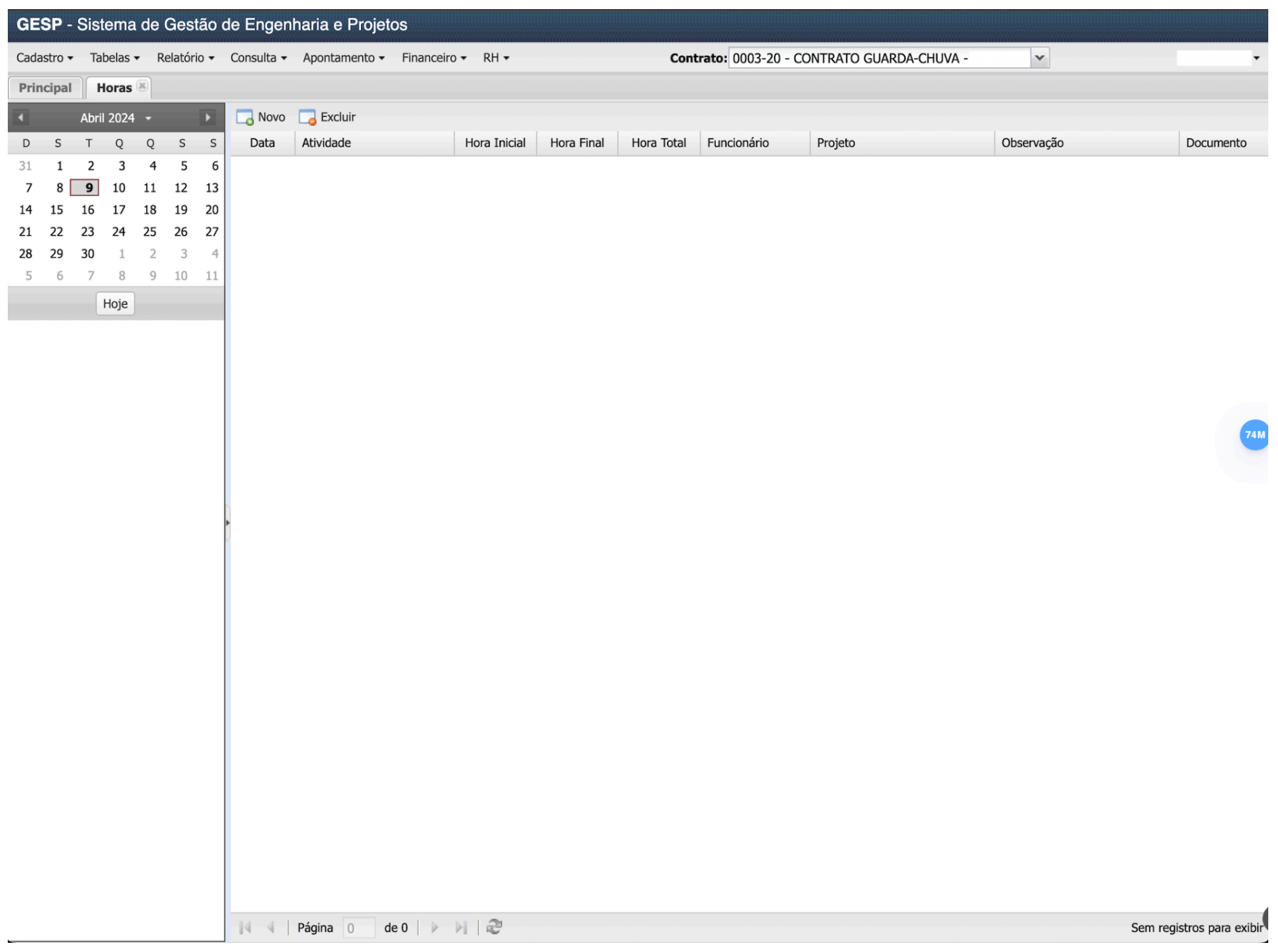
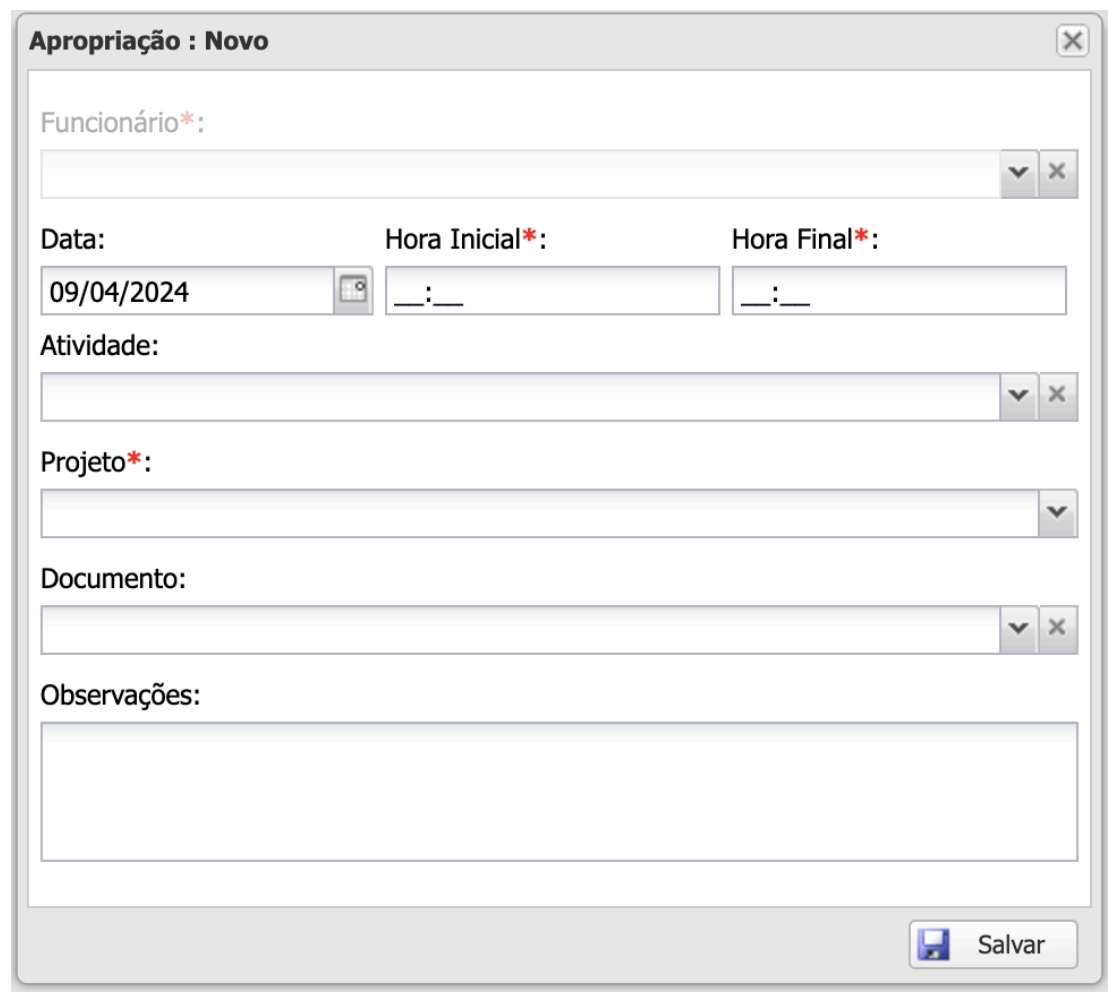
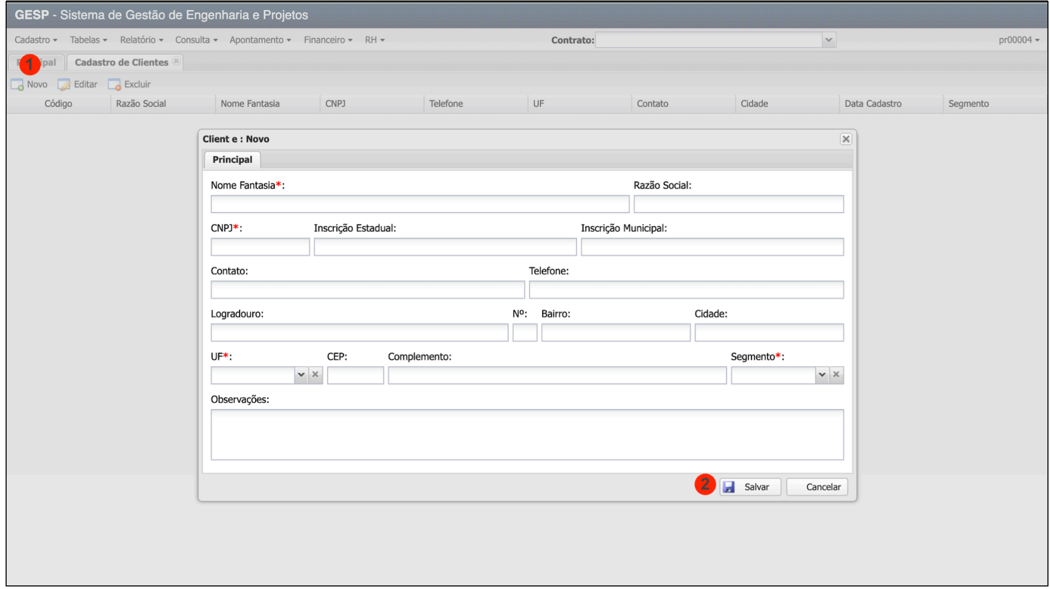
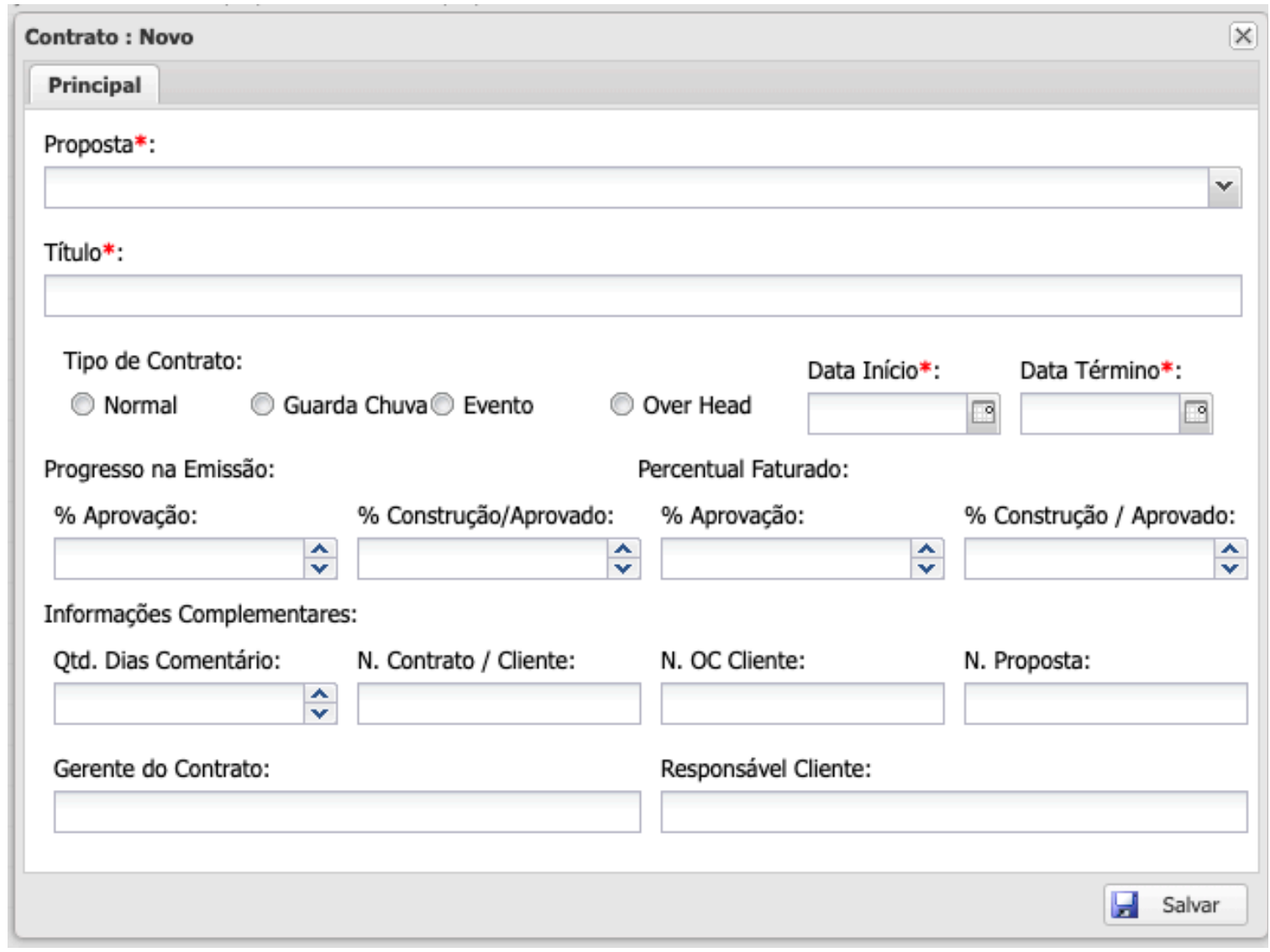
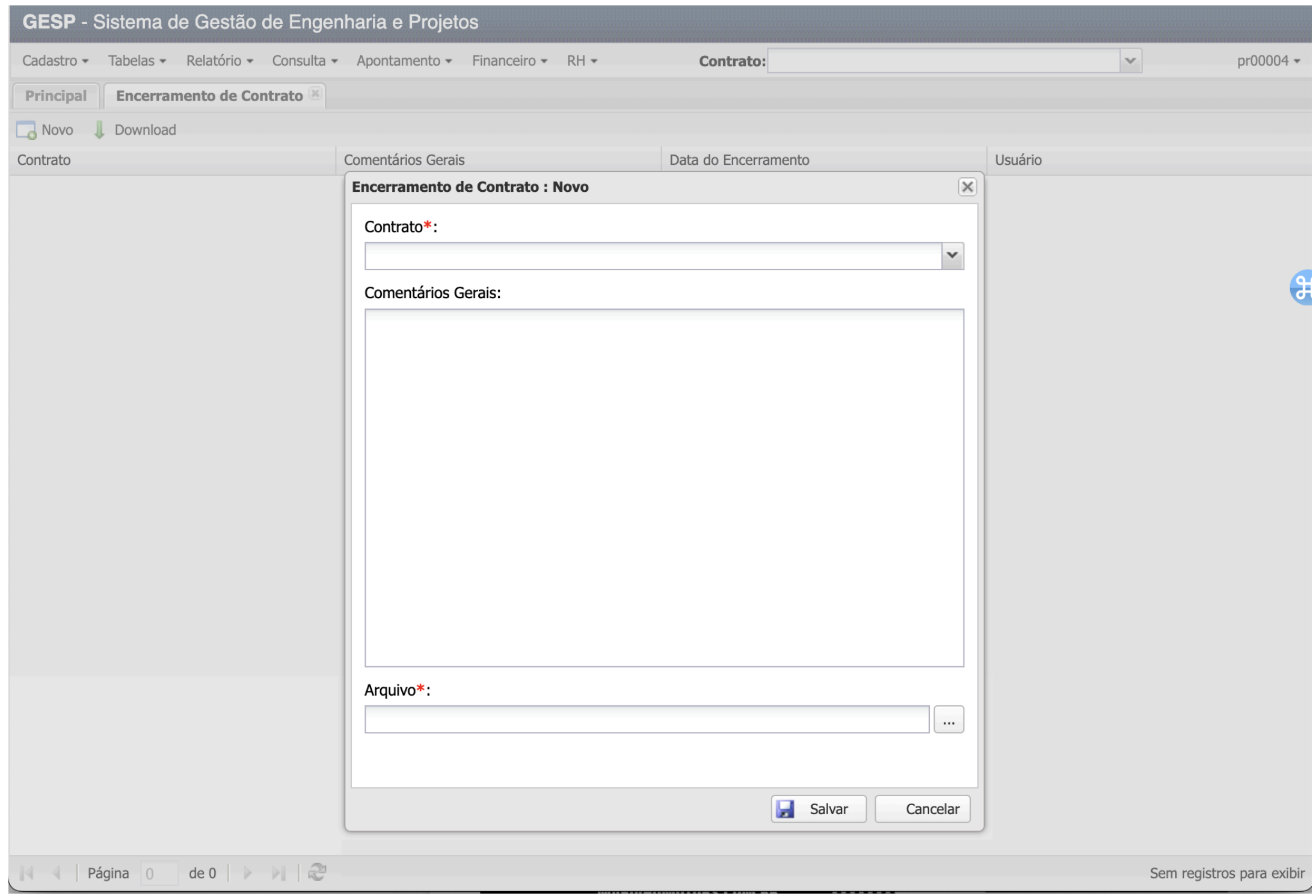
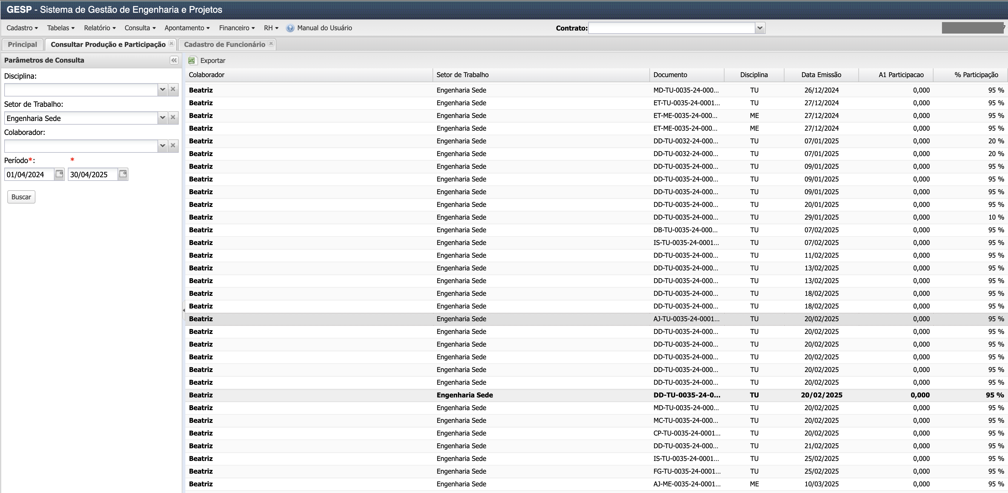
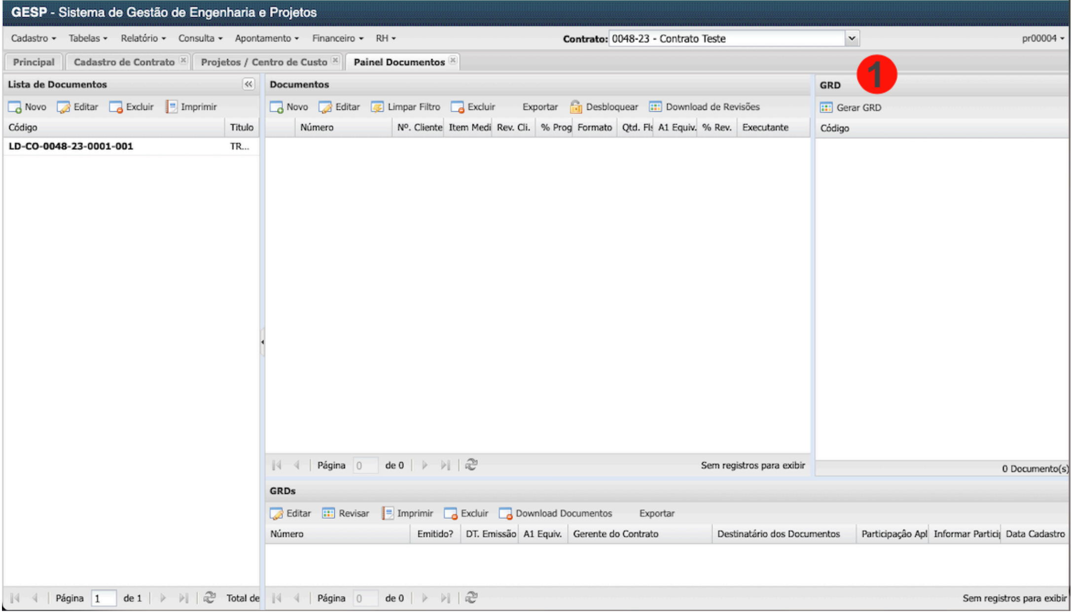

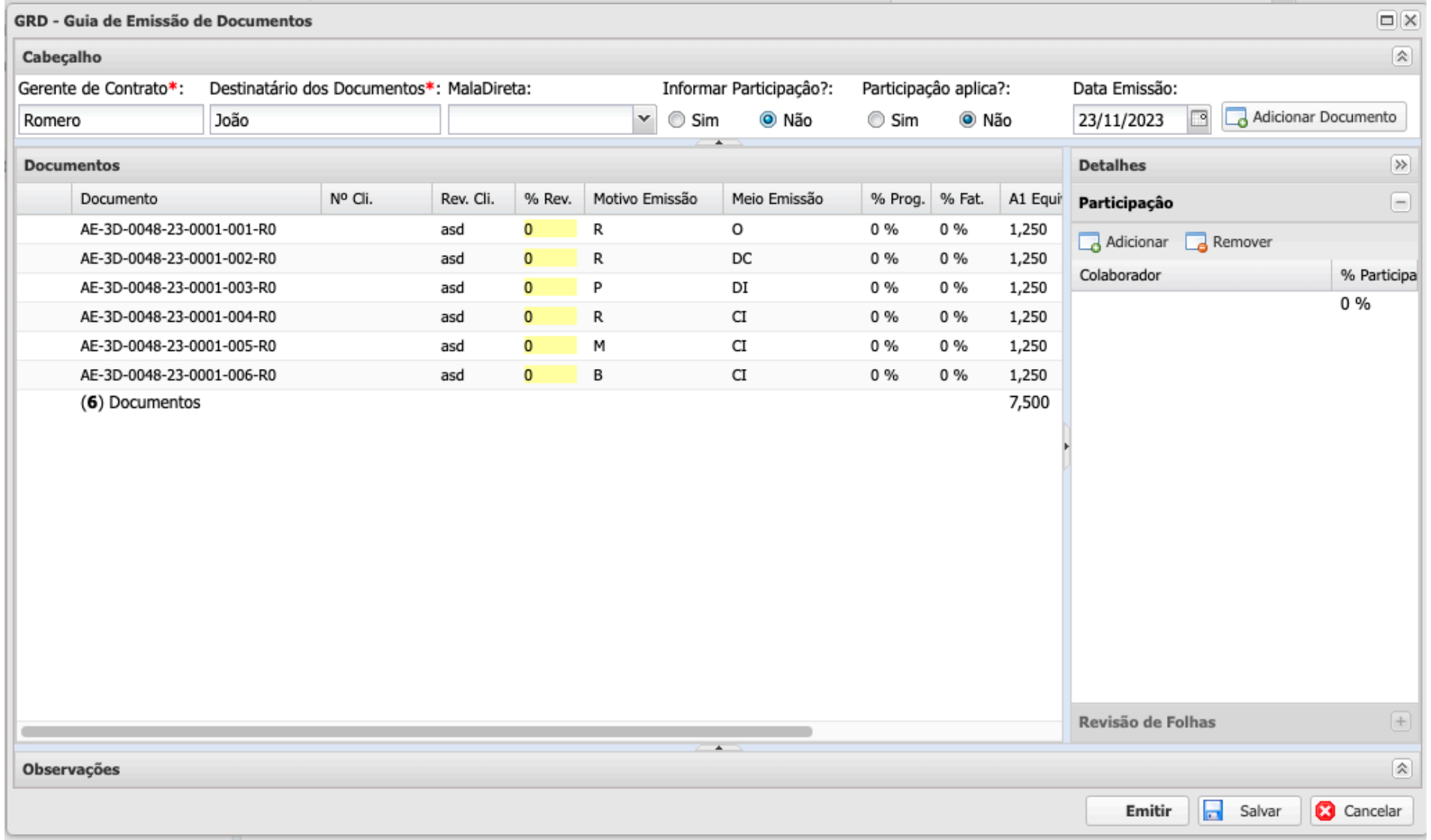
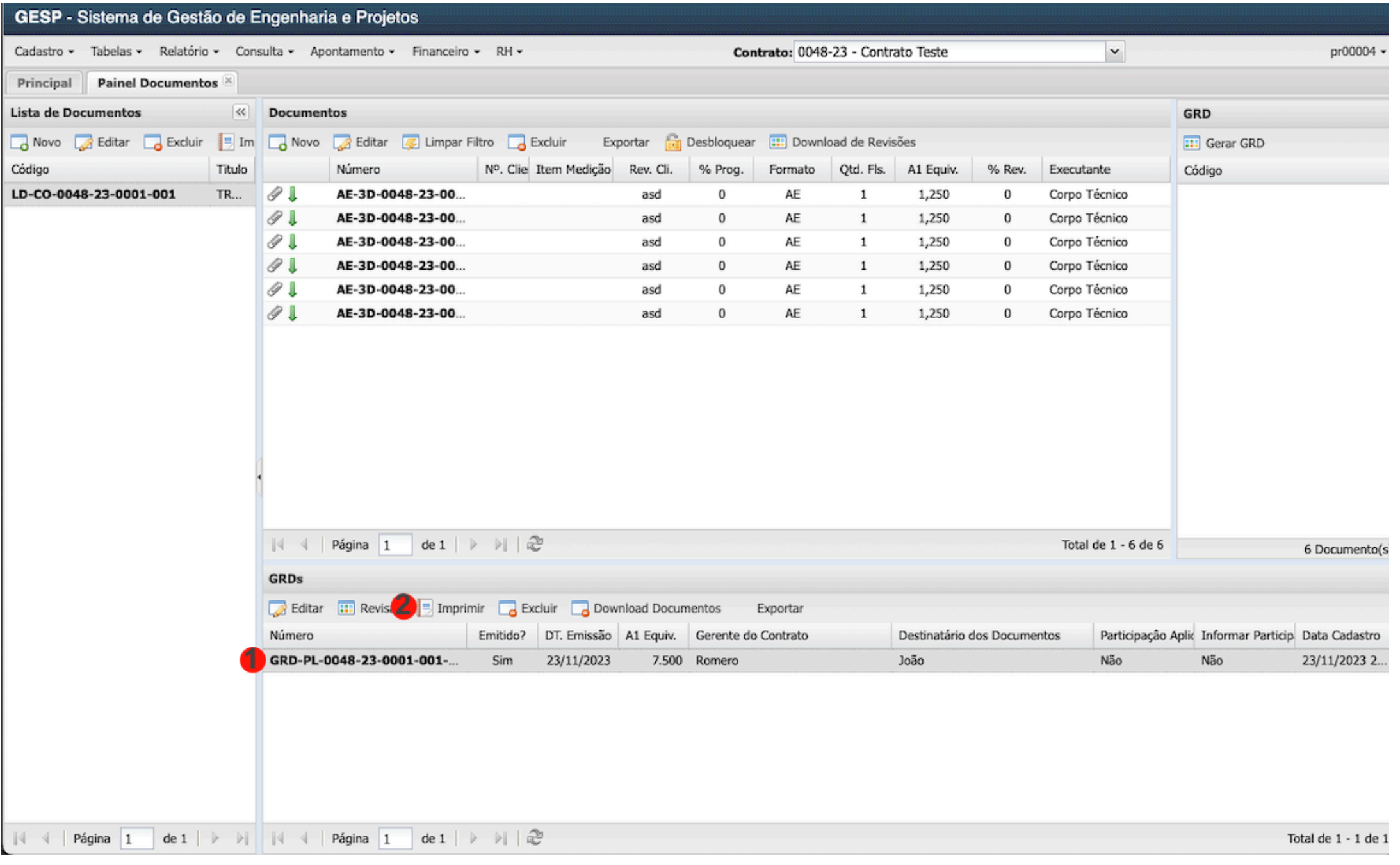
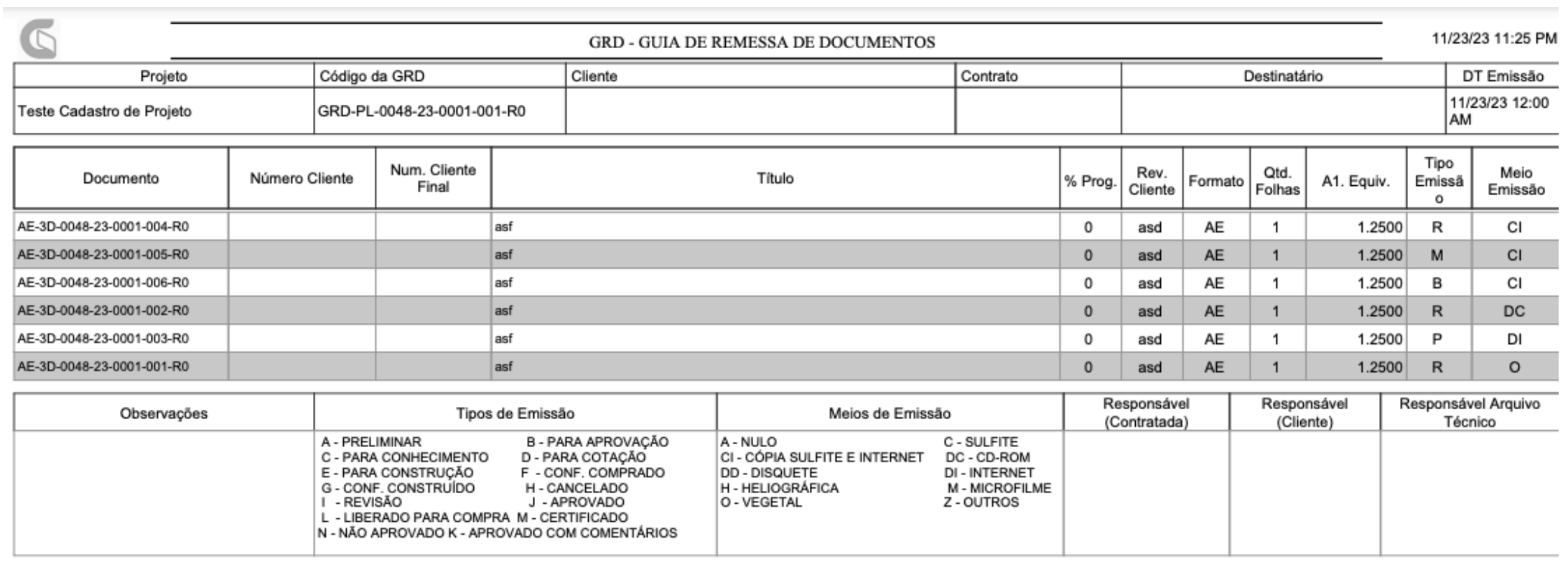
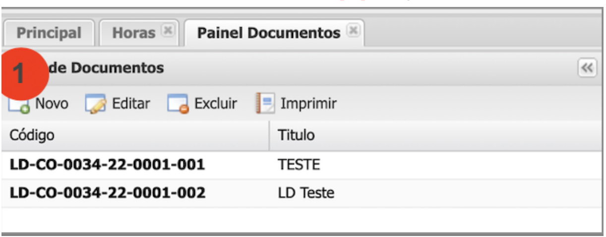
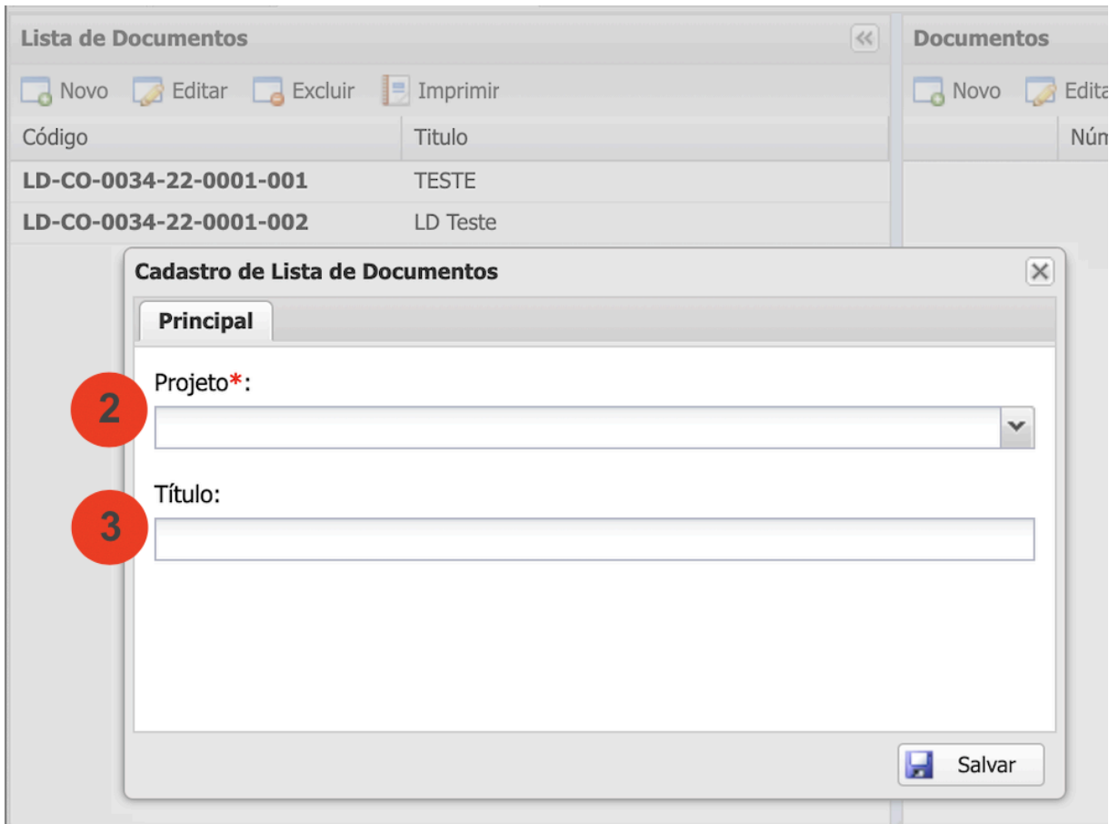
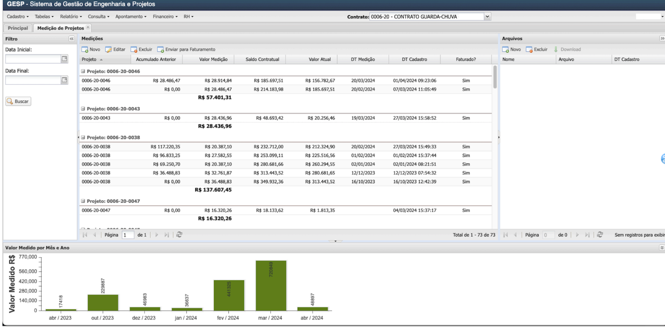
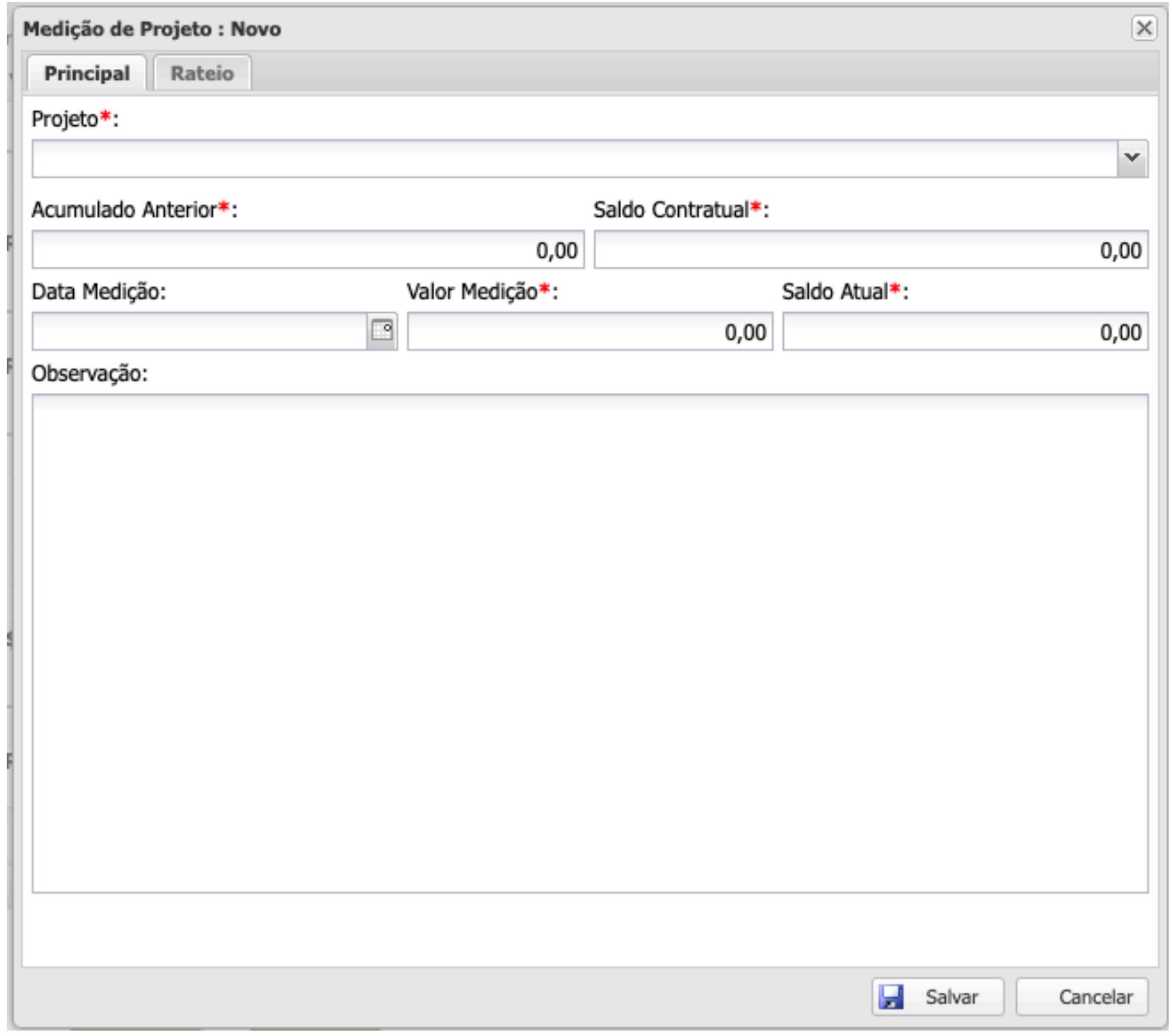
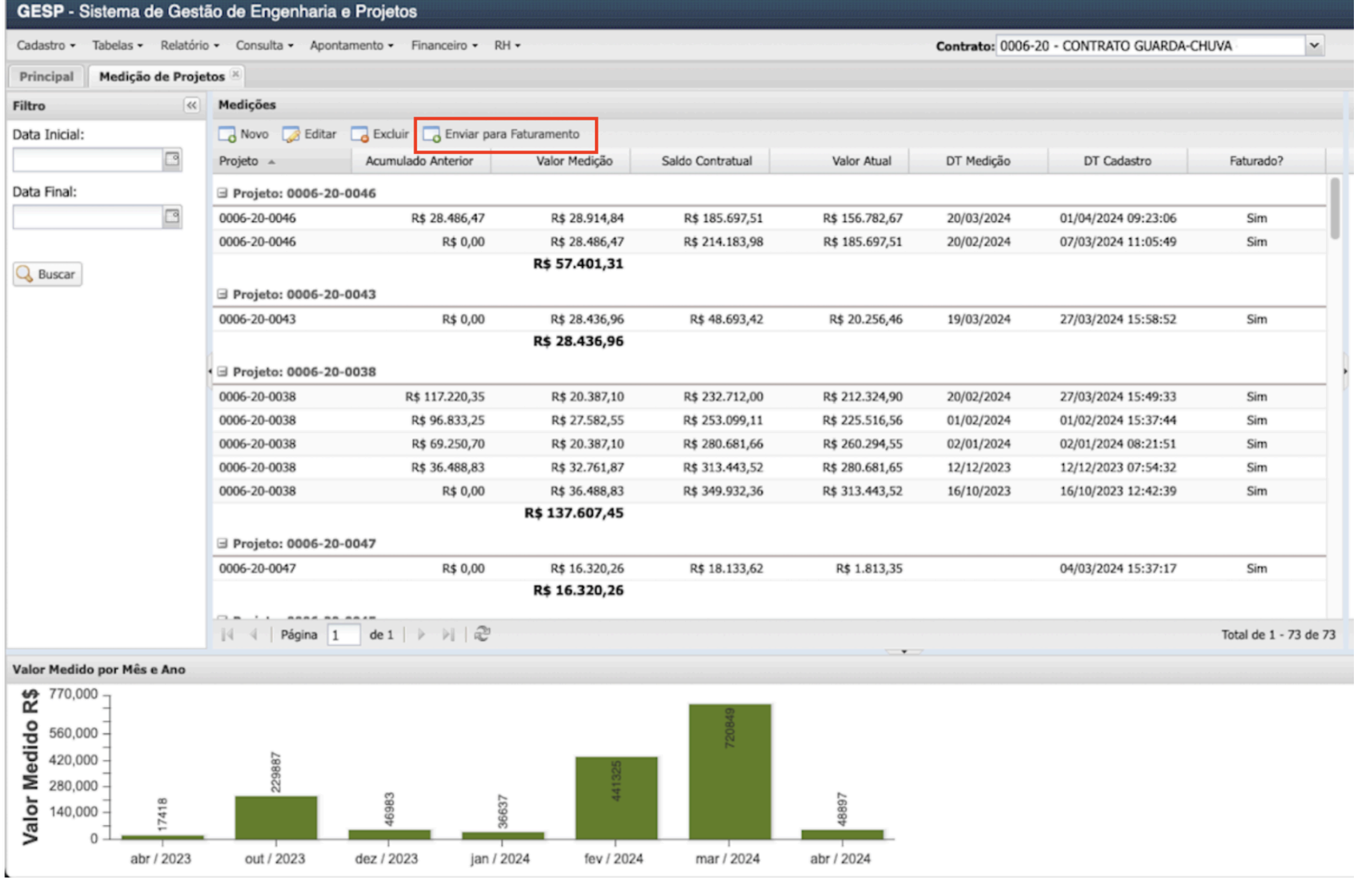
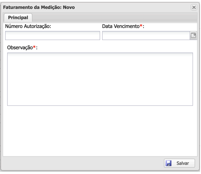
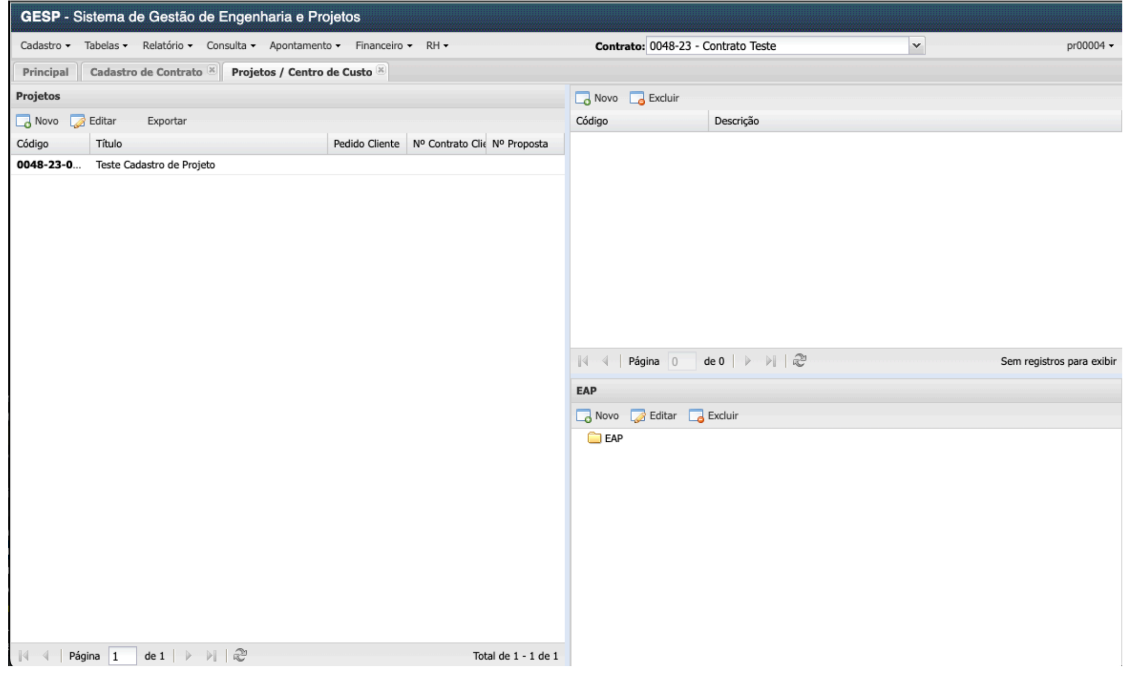
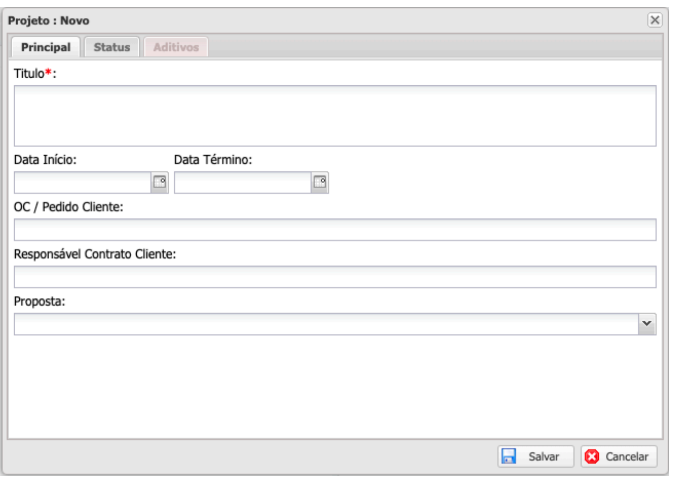
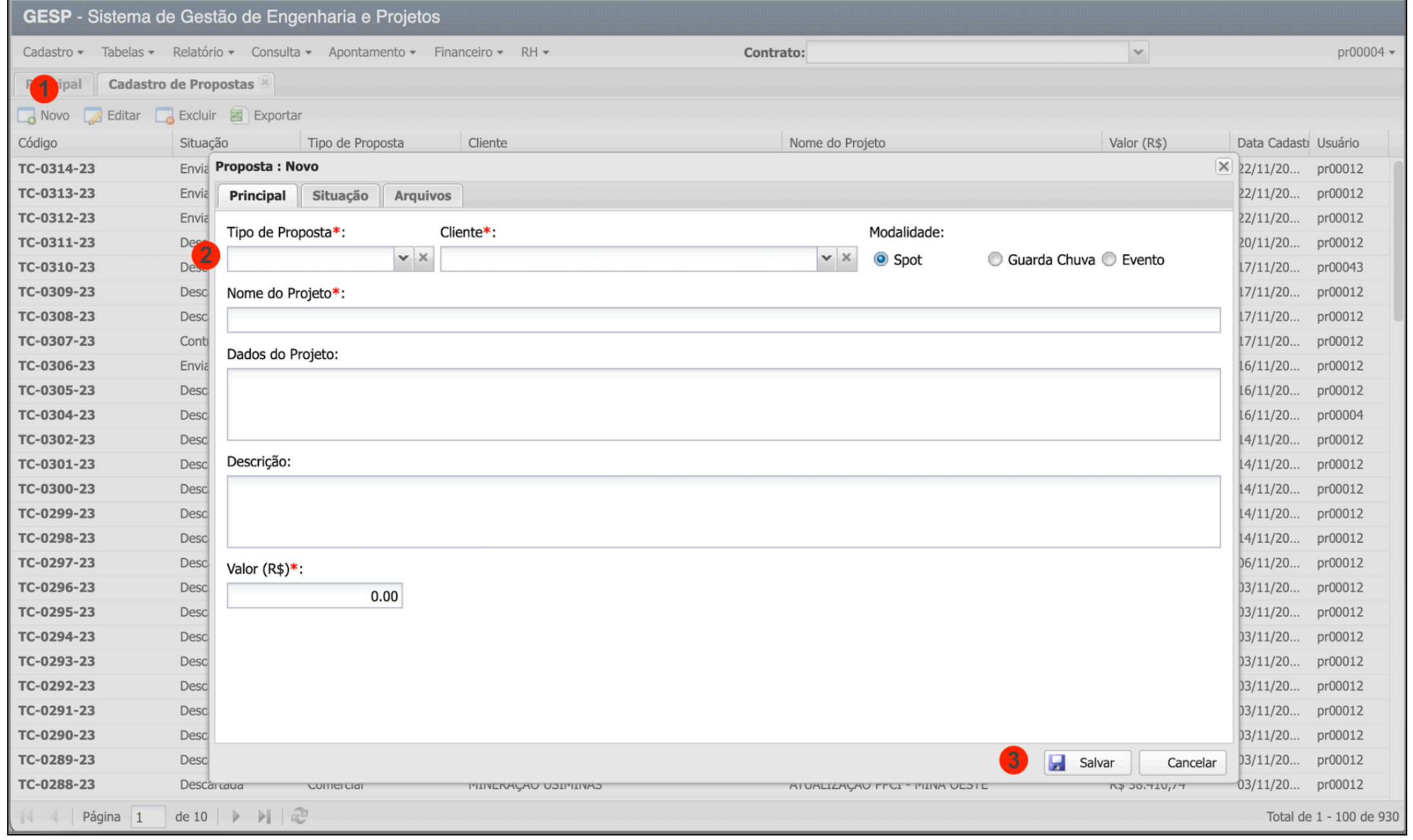
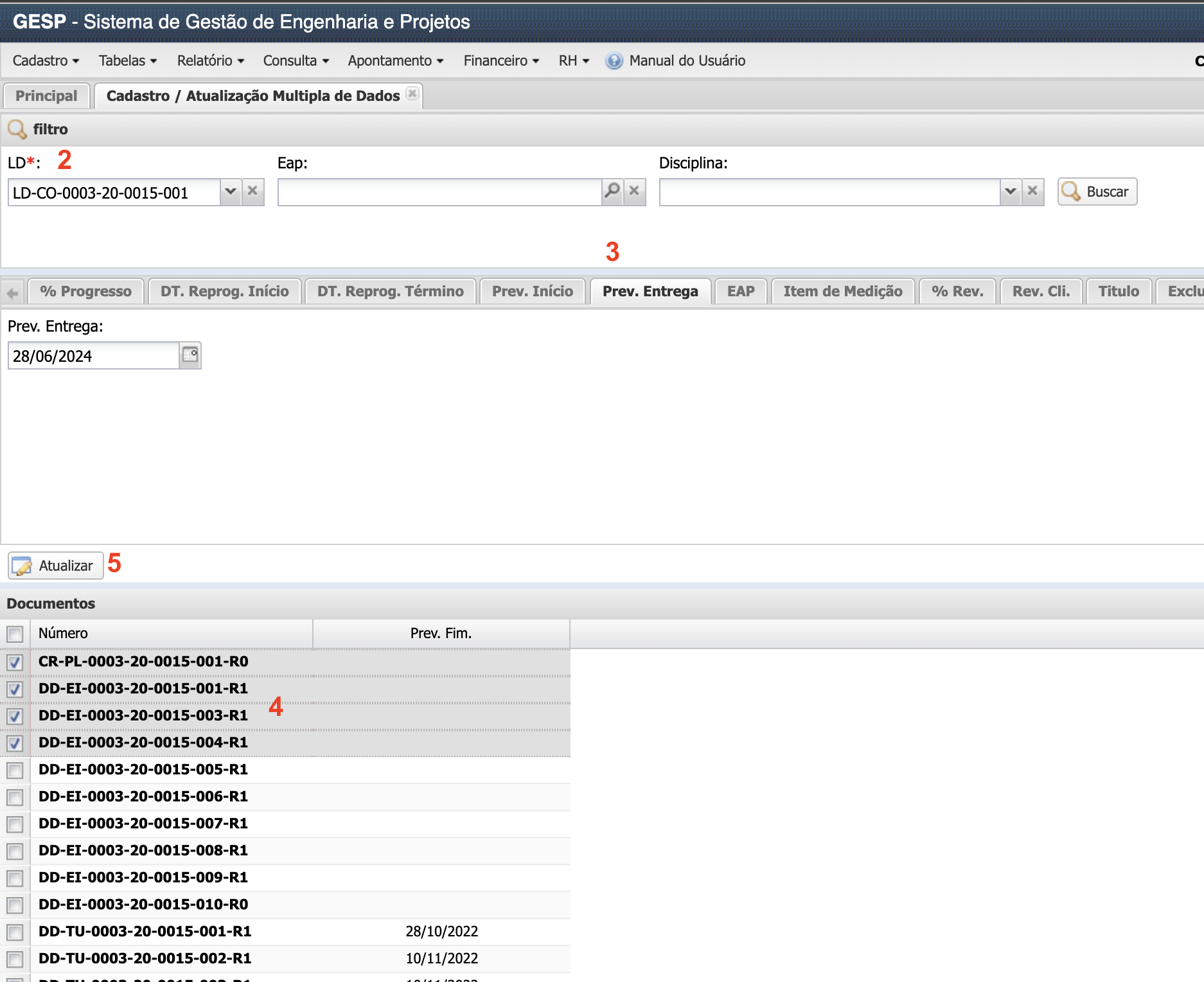
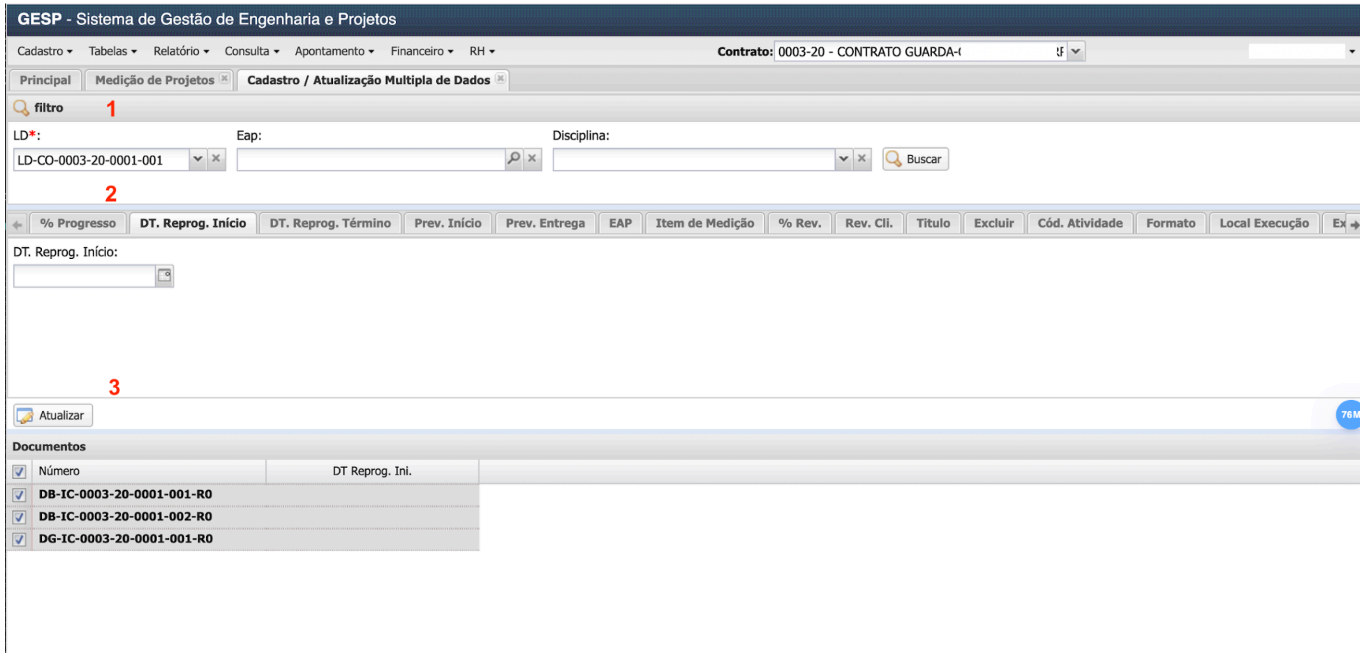
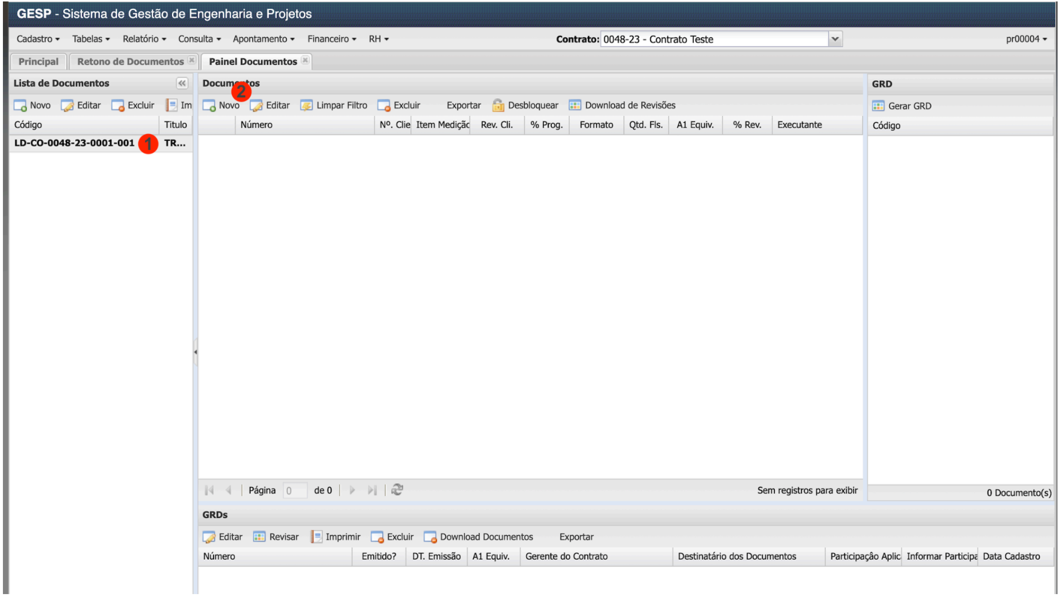
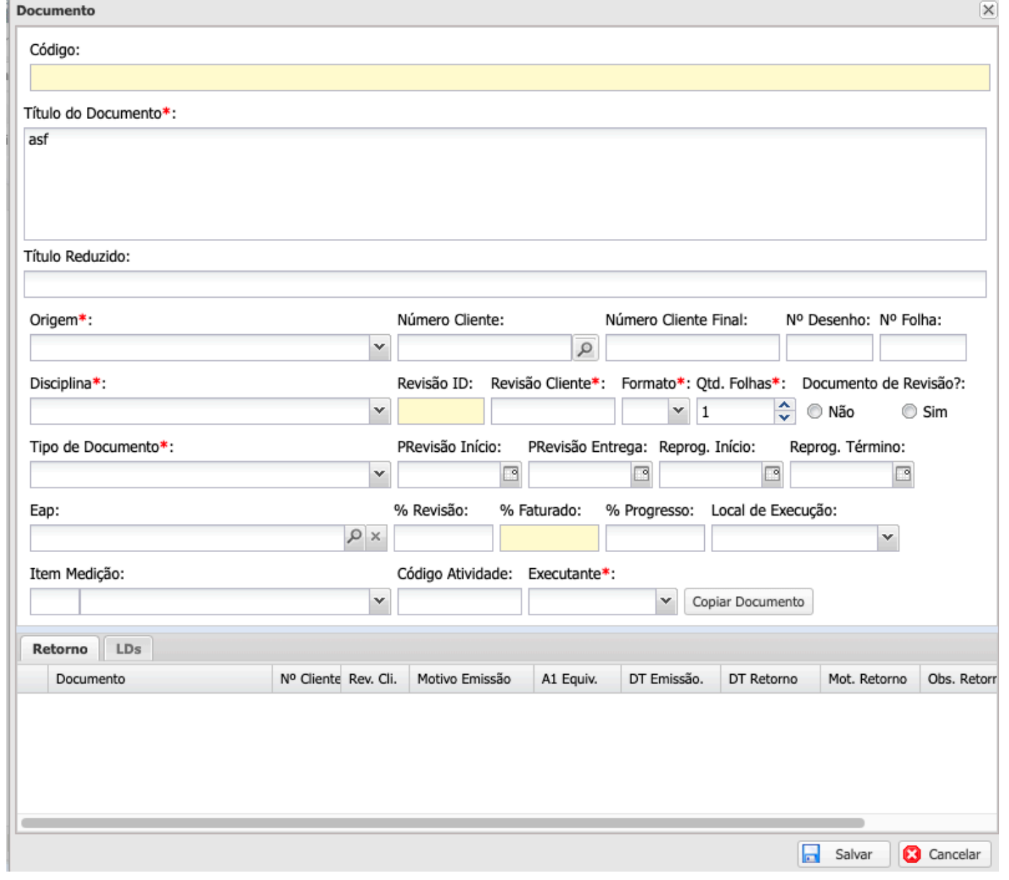
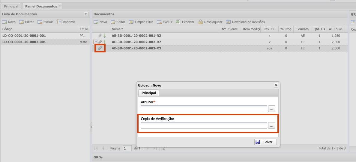
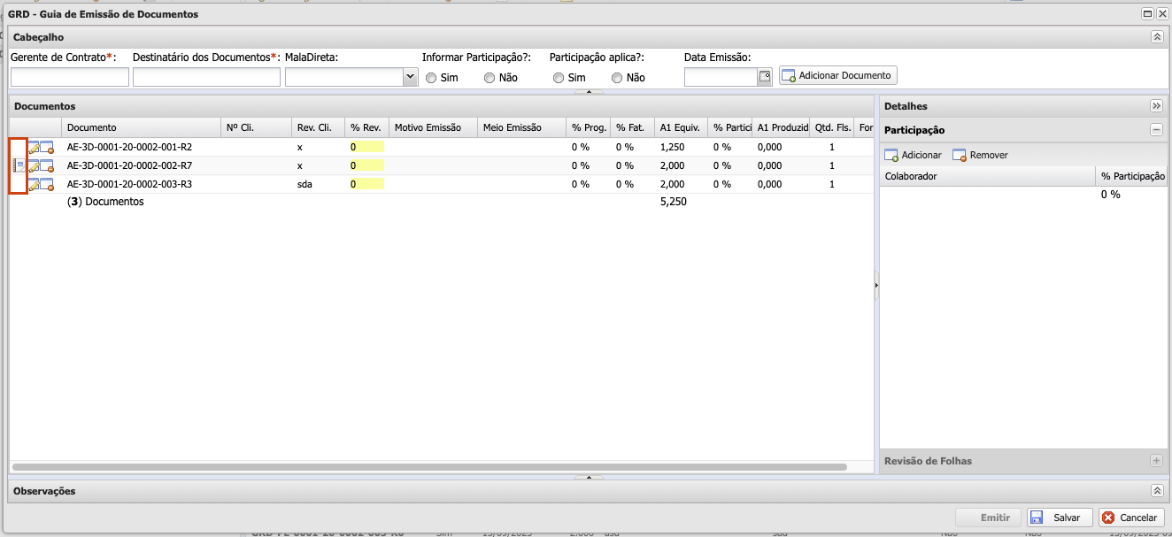
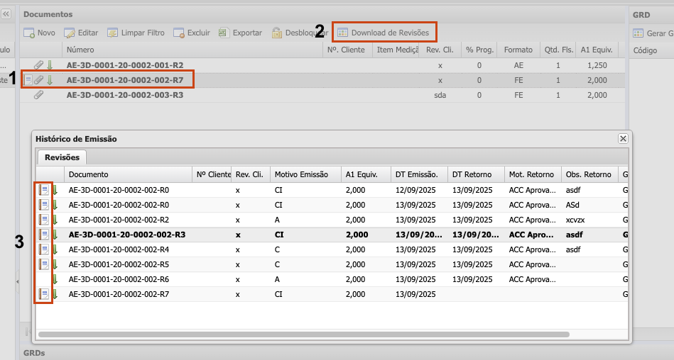
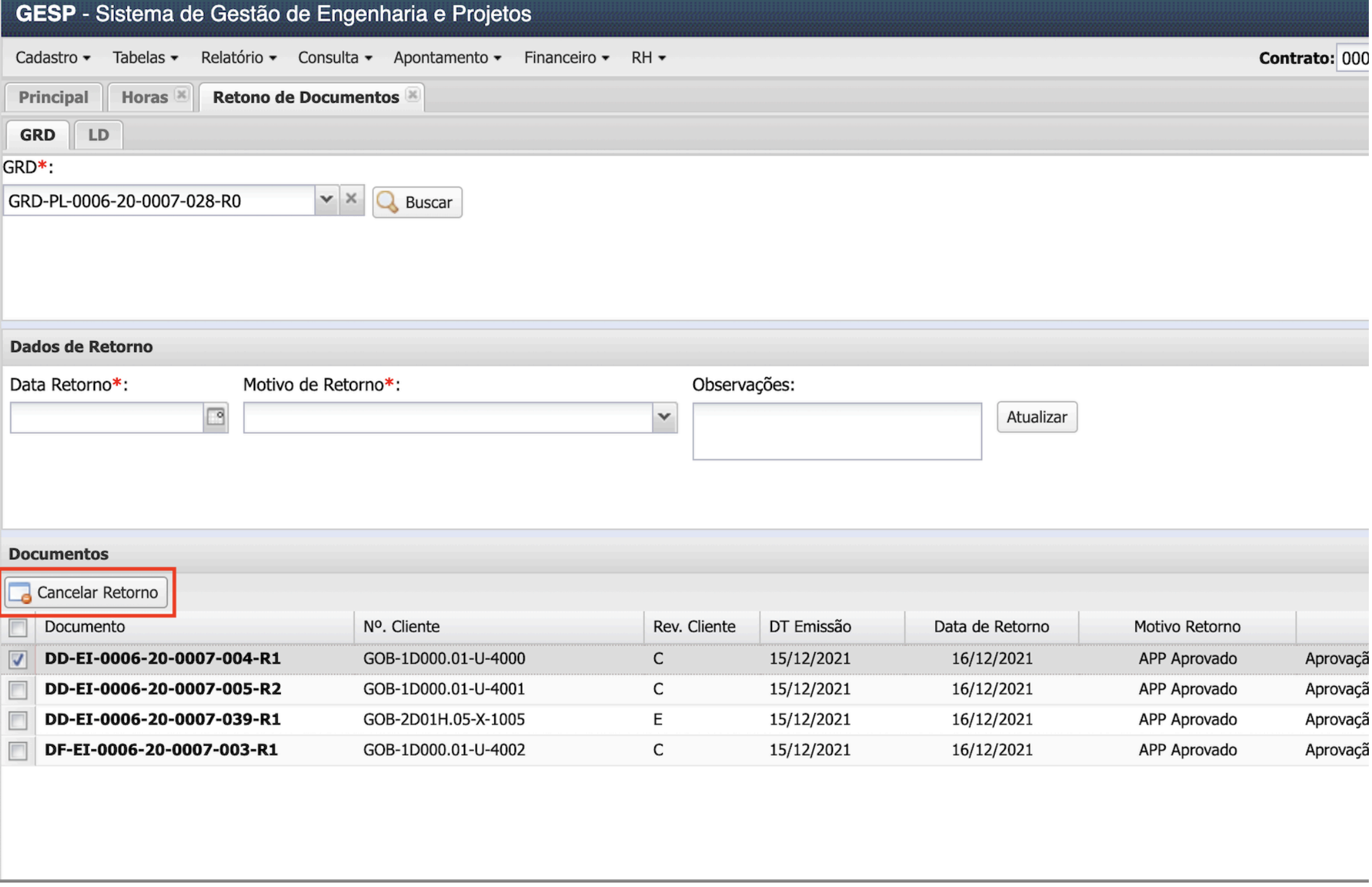
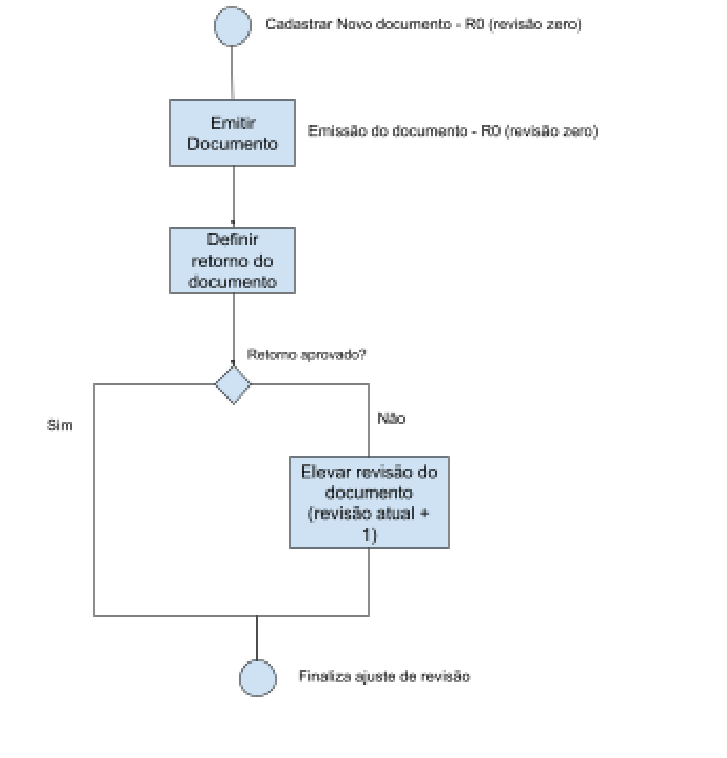
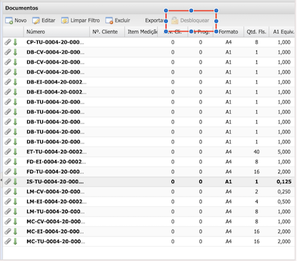
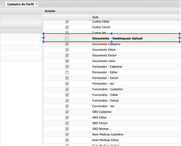
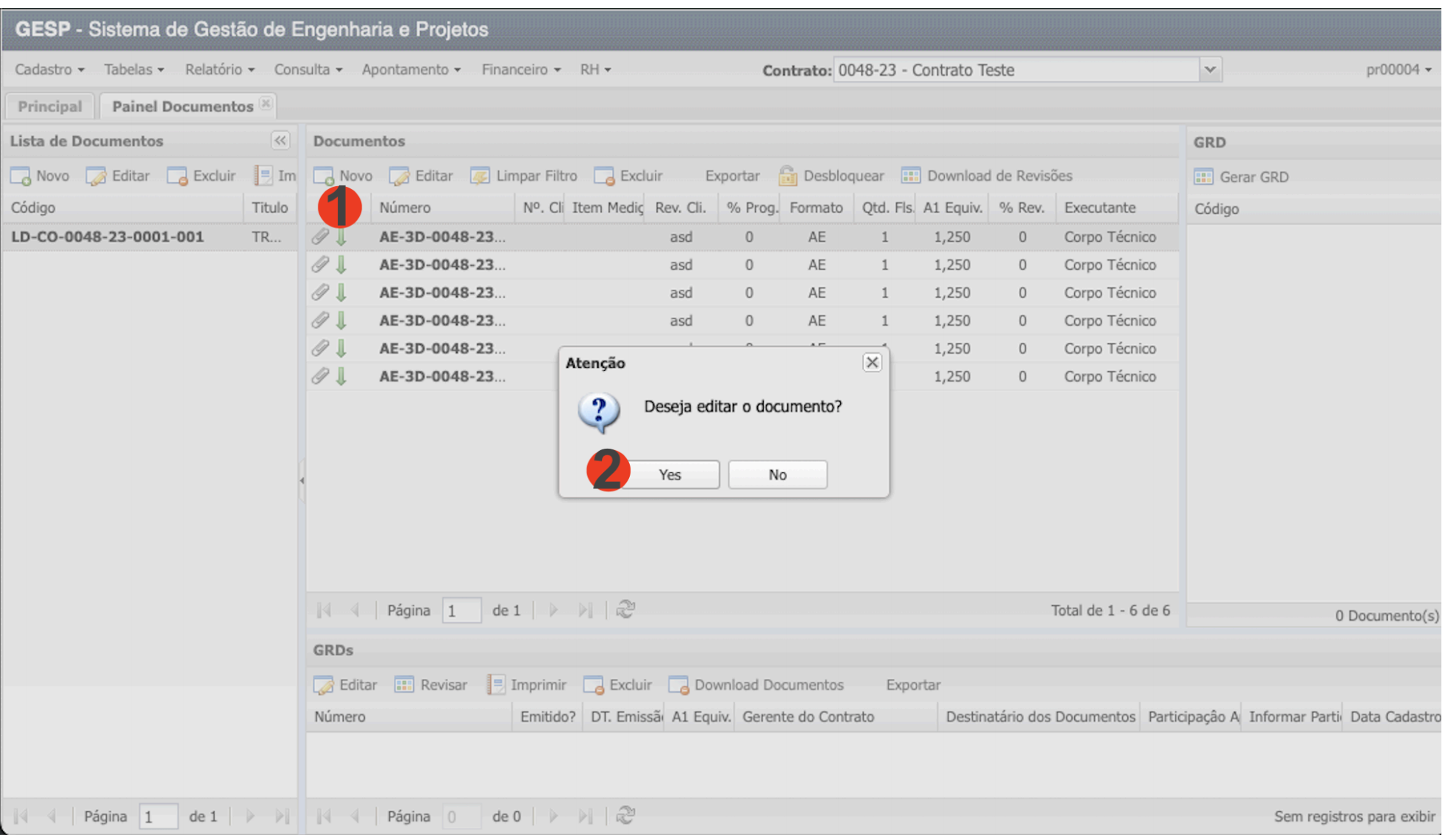
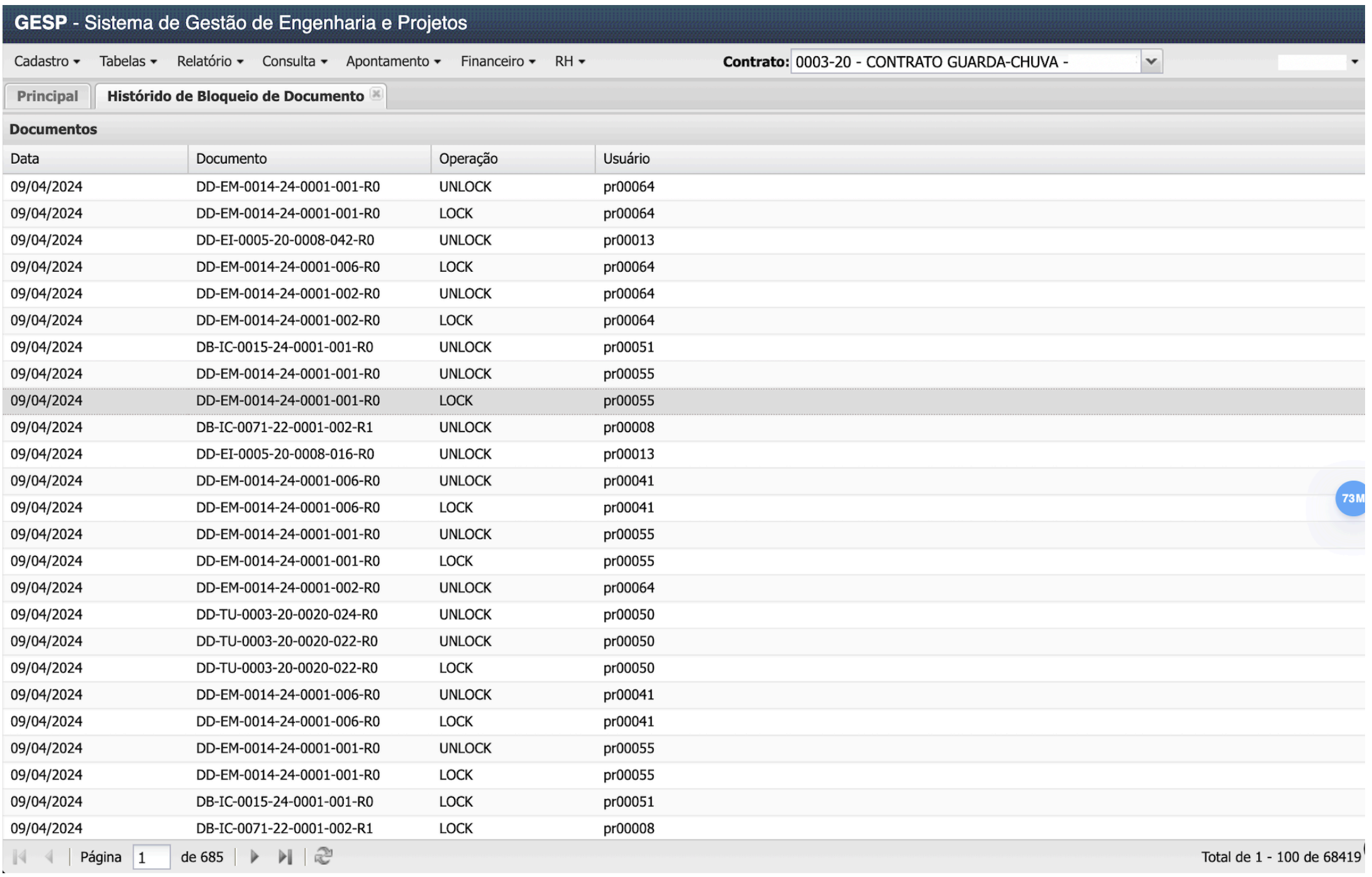
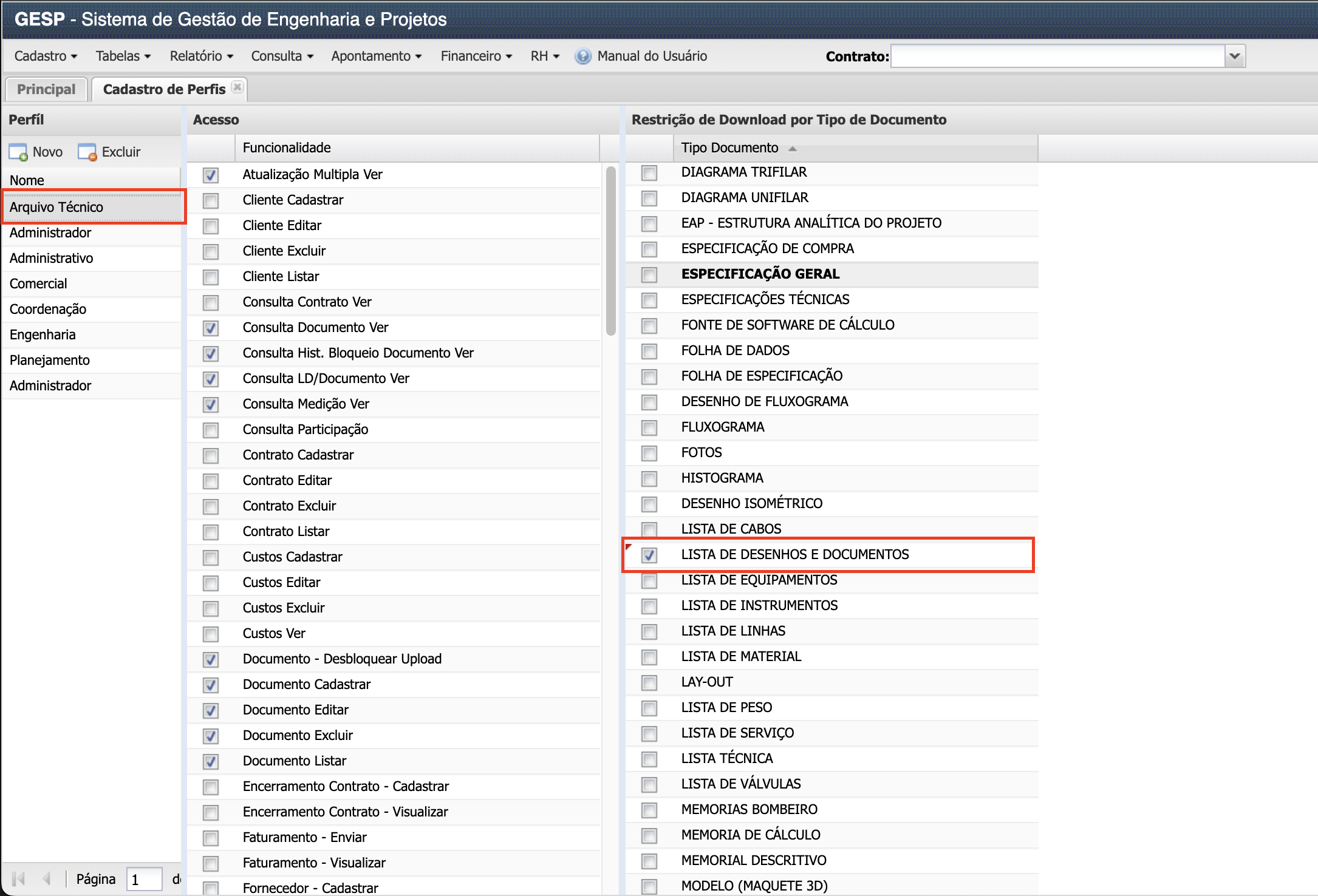
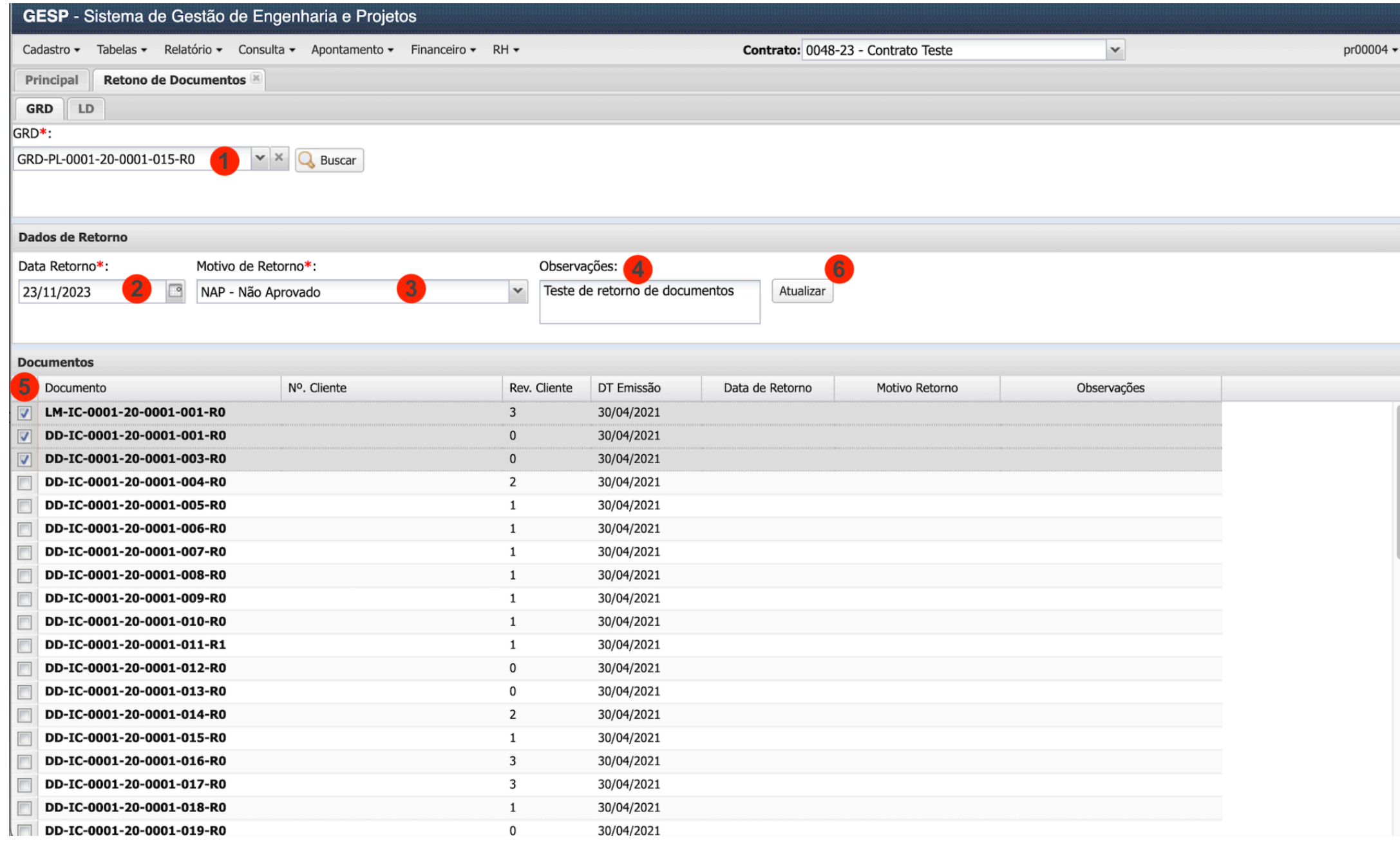
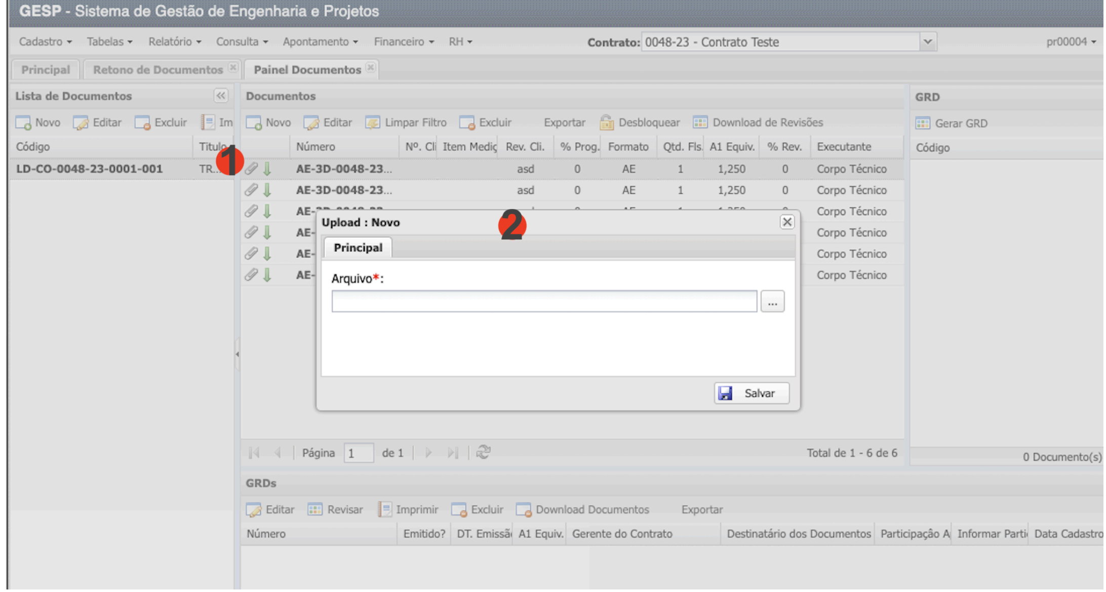
 Welcome!
 Karibu sana!